
Best Accent Tables for Small Living Rooms That Save Space and Add Style
Looking for the perfect accent table for a small living room? This roundup features stylish space-saving side tables, nesting tables, pedestal tables, and storage cabinets that add function without overwhelming your space.

7 Furniture and Decor Finds That Make a Home Feel Collected
Looking for ways to make your home feel more collected and thoughtfully designed? These seven reader-favorite furniture and decor finds bring character, warmth, and timeless style to any space. From vintage-inspired textiles to classic wood furniture, these are the pieces readers keep saving, shopping, and incorporating into their homes.

5 Living Room Design Ideas from Pinterest Worth Copying
Pinterest isn't just for inspiration—it's a valuable tool for solving real decorating challenges. In this article, I'm sharing five living room design ideas from Pinterest that offer clever solutions for everything from dark wood paneling and split-level floor plans to empty corners and built-in storage.
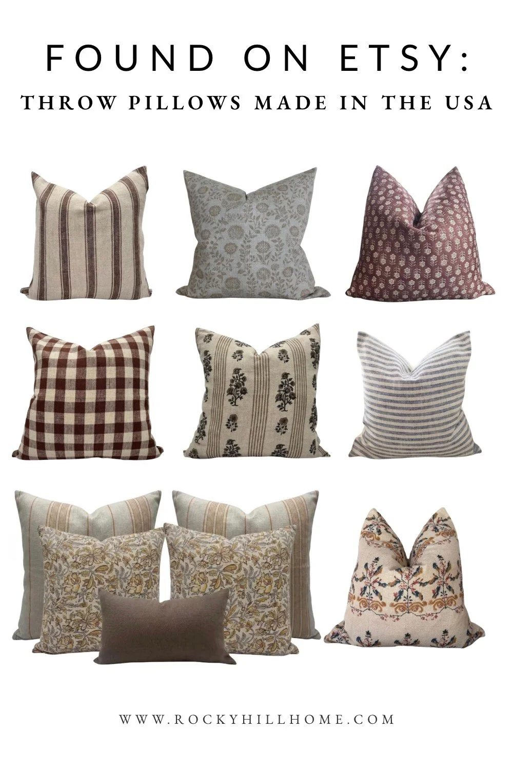
Throw Pillows Made in the USA: Beautiful Etsy Pillow Covers for a Collected Home
A curated roundup of beautiful Etsy pillow covers made in the USA, featuring timeless stripes, florals, checks, and vintage-inspired patterns for a layered, collected home.
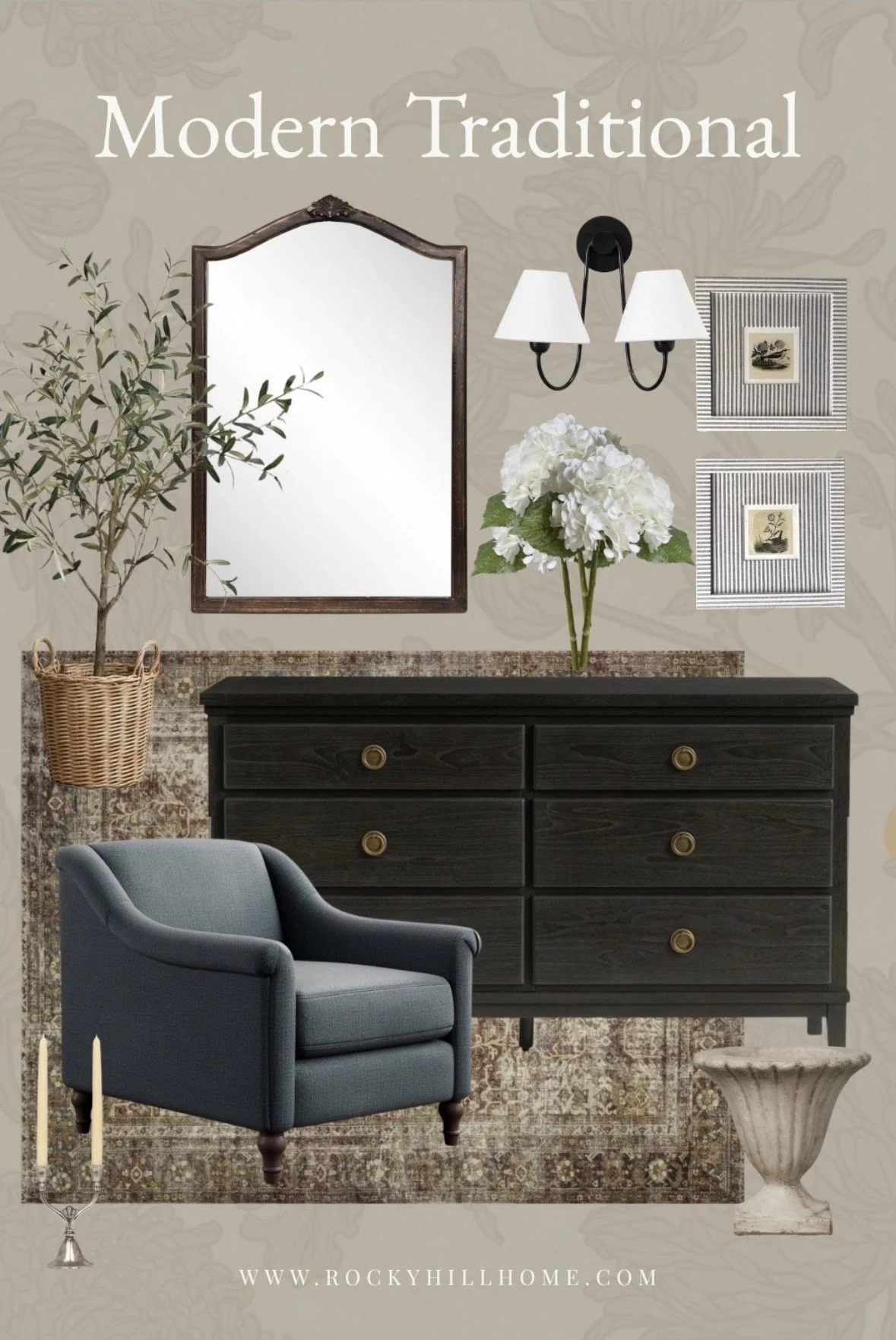
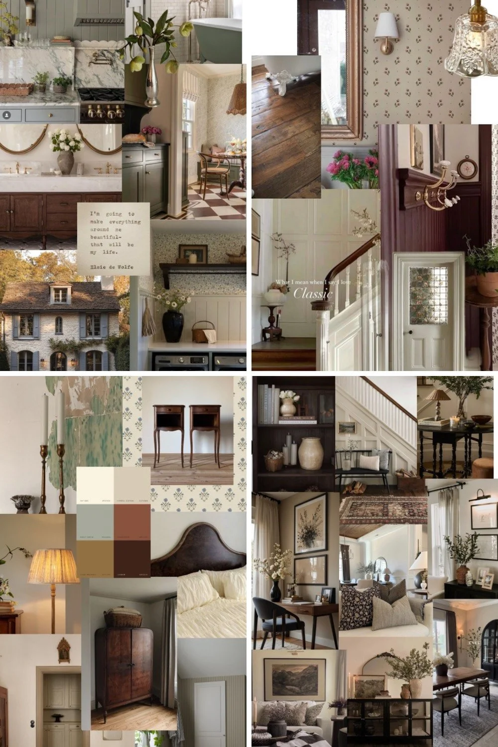
Home Decor Mood Boards: Recent Design Inspiration from My LTK Collection
A roundup of recent home decor mood boards from my LTK, filled with living room, bedroom, and whole-home design inspiration for creating a layered, timeless home.
Pinterest Inspired Whole House Color Palettes You'll Want to Copy
Pinterest is one of the best places to discover beautiful, cohesive home color palettes. In this article, I'm sharing some of my favorite Pinterest-inspired whole house color schemes, from warm modern traditional neutrals to heritage greens and soft European cottage colors. Learn how to use Pinterest to identify your personal style, create visual continuity between rooms, and build a timeless color palette that flows throughout your entire home.

8 Cabinets With Personality That Instantly Elevate a Room
Looking for storage furniture that makes a statement? Discover 8 unique cabinets, sideboards, and credenzas with beautiful finishes, distinctive details, and designer-inspired style to add personality and character to any room.
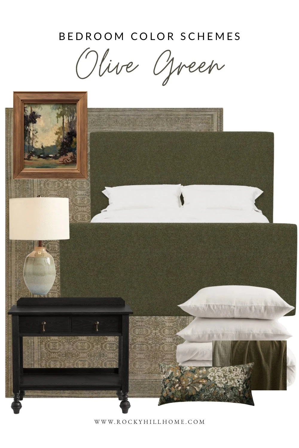
Olive Green Bedroom Ideas: Moody vs Light Color Schemes
Two olive green bedroom ideas showing how to style this earthy color in both a light, calming palette and a moody, layered bedroom design.
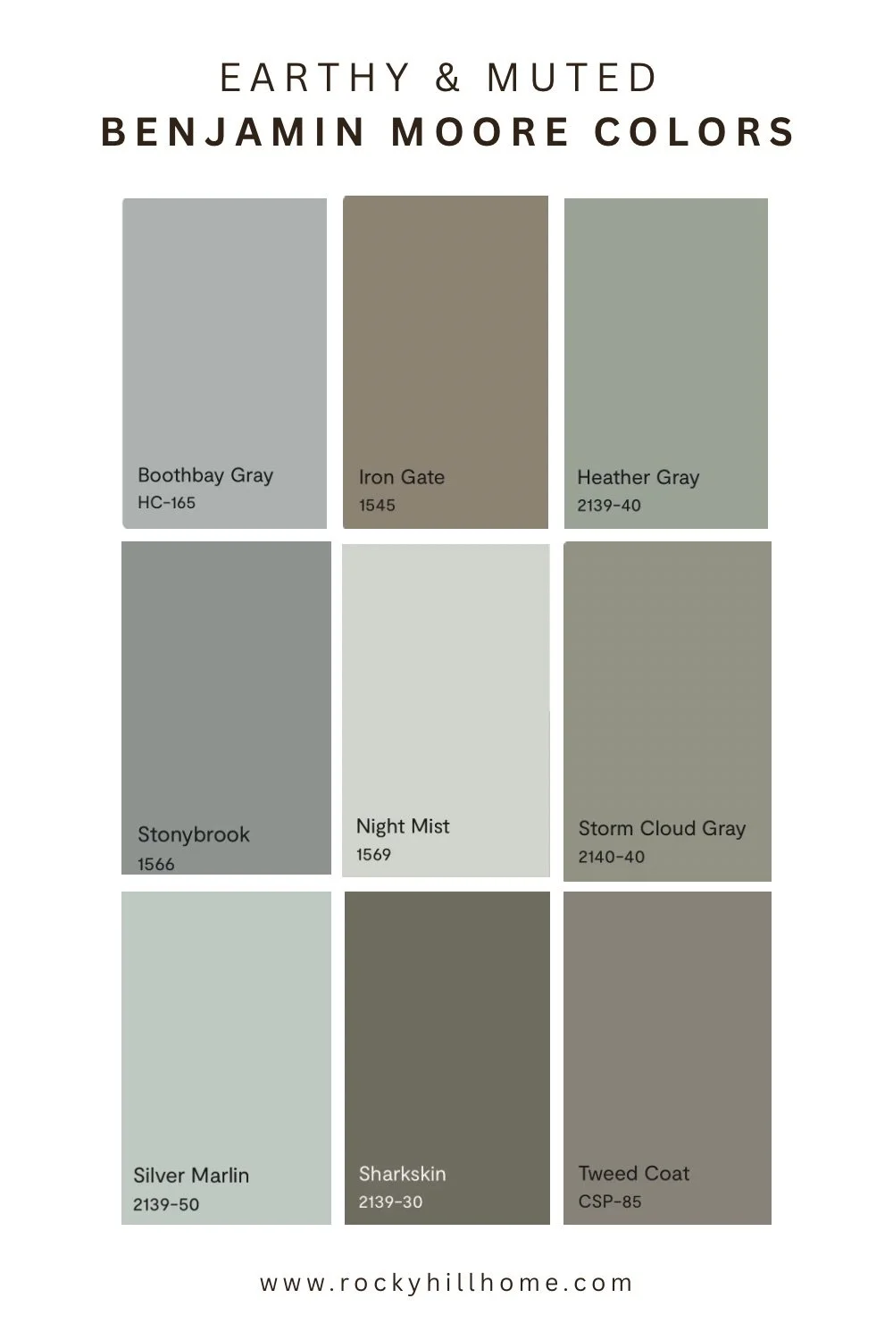
The Best Muted Paint Colors for a Calm, Timeless Home
Muted paint colors are the perfect middle ground between bold color and traditional neutrals. Discover nine earthy Benjamin Moore shades that bring subtle color, warmth, and timeless style to any room.
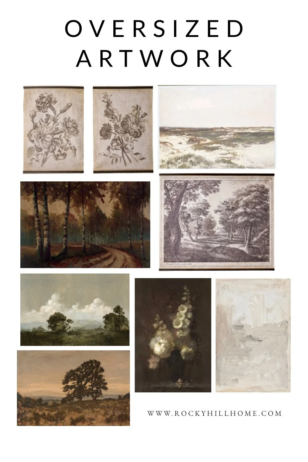
8 Best Oversized Wall Art Pieces Under $300 for a Designer Look
Oversized artwork is one of the easiest ways to make a room feel polished and expensive. These large-scale wall art finds under $300 add warmth, scale, and designer style without the high-end price tag.
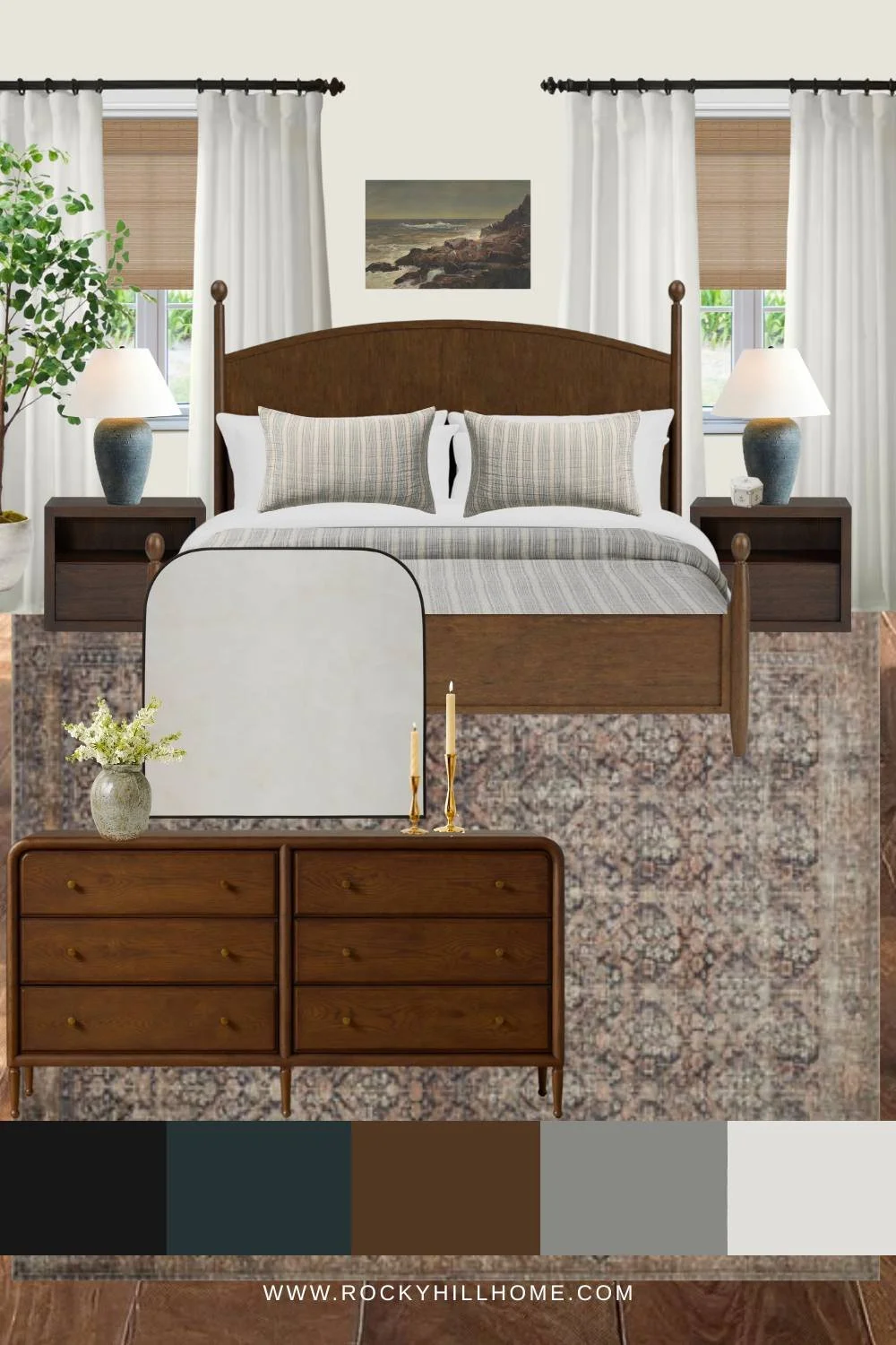
Neutral Bedroom with Blue Accents Mood Board in a Warm Modern Traditional Style
Looking for a bedroom that feels warm, timeless, and relaxing? This neutral bedroom with blue accents combines rich wood furniture, soft textiles, vintage-inspired details, and calming blue-gray tones for a cozy modern traditional look. Perfect for New England, coastal cottage, and transitional homes.
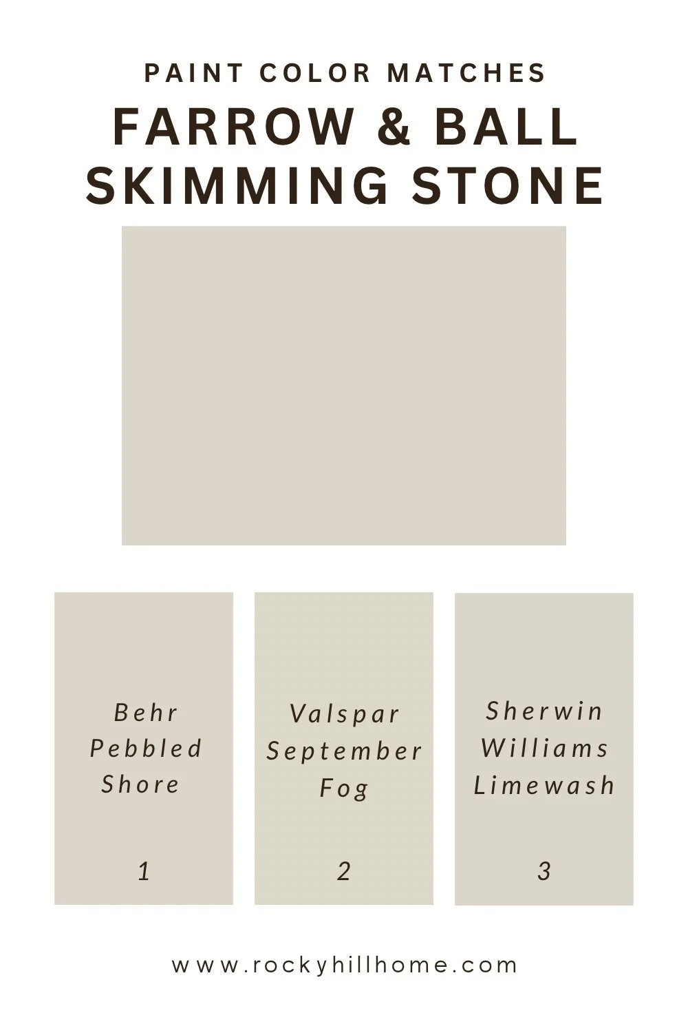
Paint Color Matching Made Easy: My Favorite Free Website
Looking for the easiest way to match paint colors across brands? This free paint color matching website helps you find close matches, dupes, and alternatives from Benjamin Moore, Sherwin-Williams, Behr, Farrow & Ball, and more.
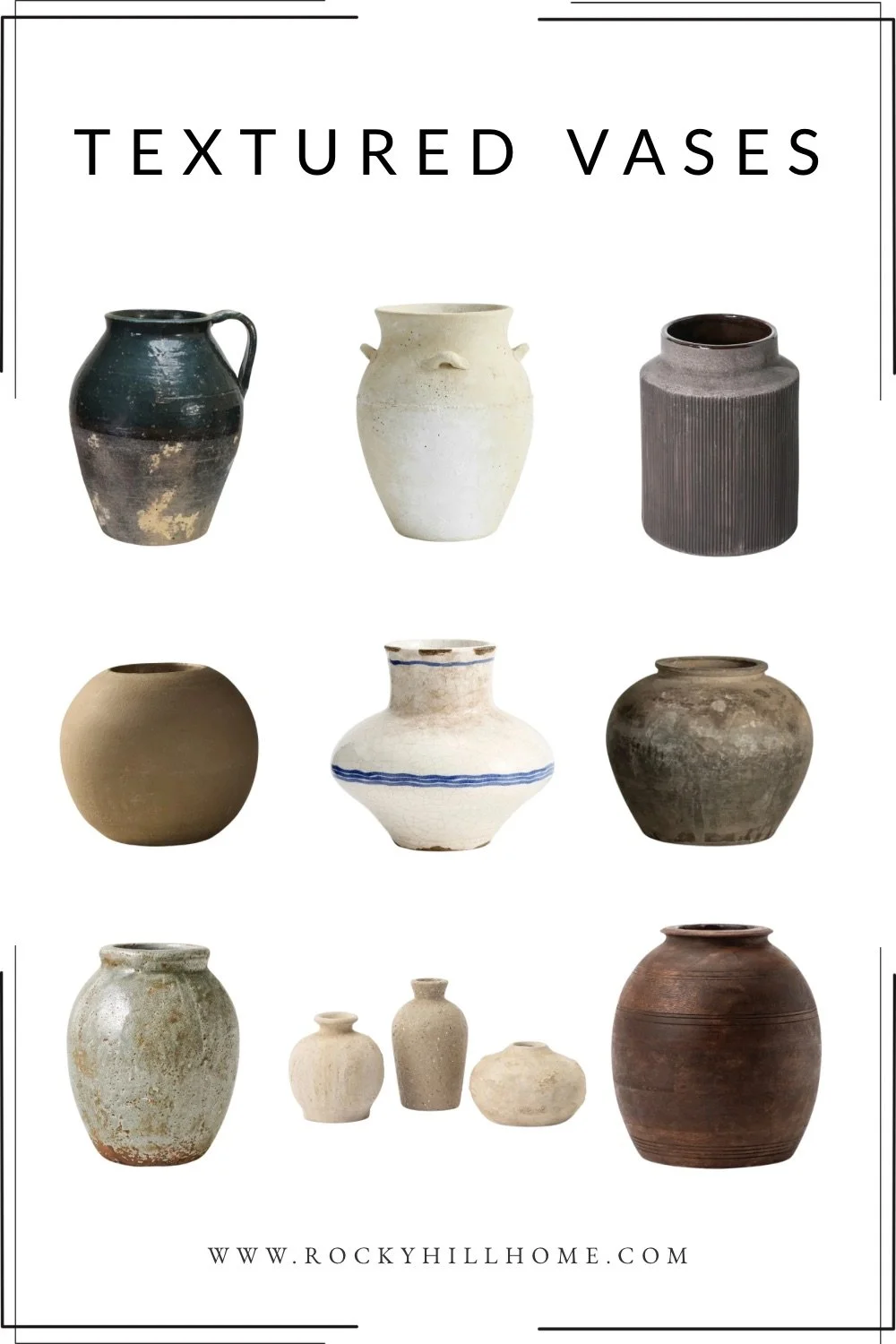
Textured Vase Roundup: The Best Earthy Ceramic Vases for a Cozy Collected Home
This textured vase roundup includes earthy ceramic vases, rustic pottery, ribbed details, and warm neutral pieces that add a collected, designer-inspired feel to any space.
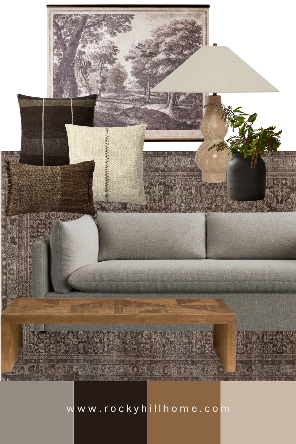
How to Style a Gray Sofa: Warm Color Palette Ideas for a Cozy Designer Look
Two warm and layered gray sofa color palette ideas using earthy neutrals, moody blues, vintage rugs, textured pillows, and timeless living room decor.
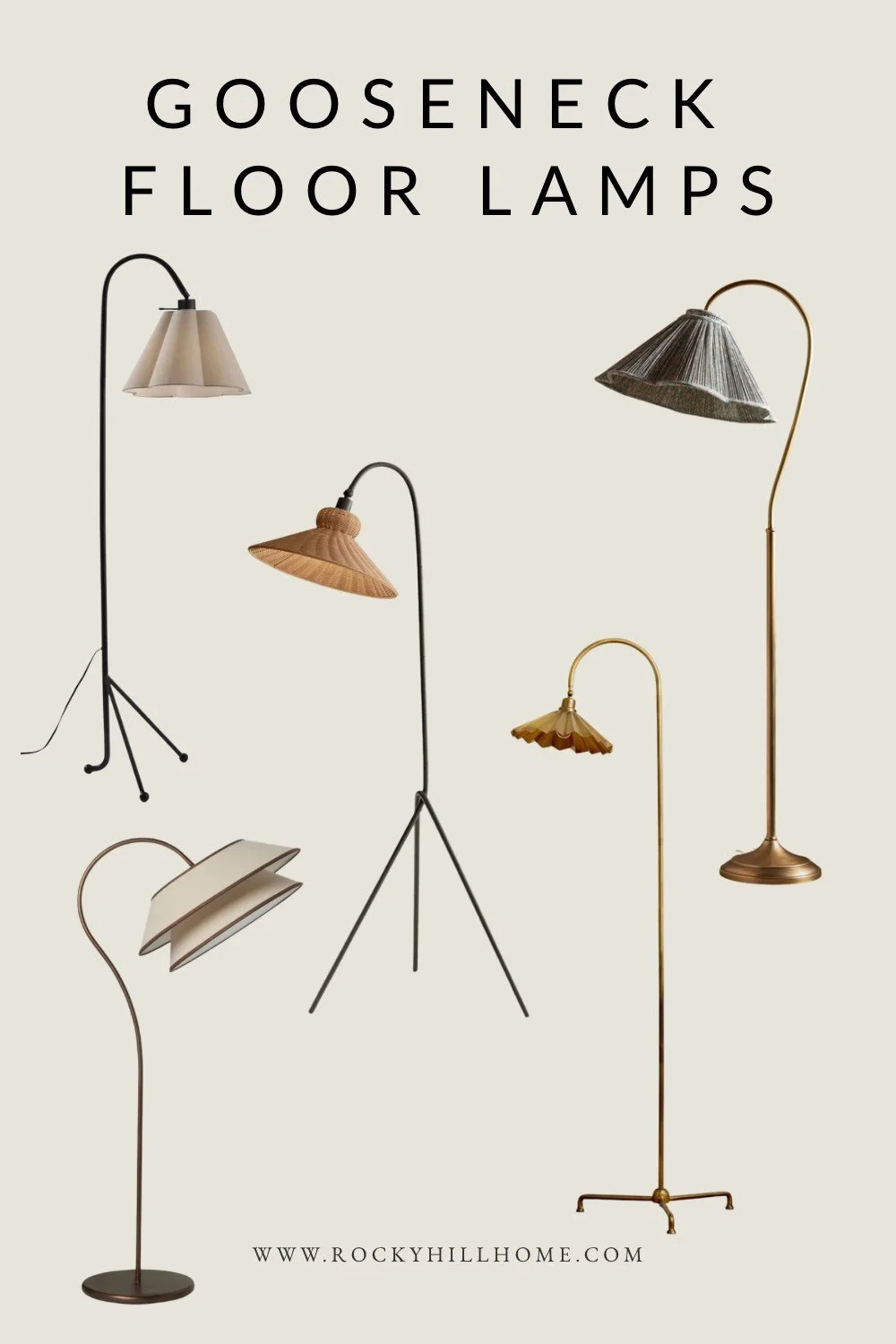
The Best Gooseneck Floor Lamps for a Cozy, Designer Living Room
Looking for the perfect gooseneck floor lamp? These curved floor lamps add warmth, texture, and designer style to cozy transitional, coastal cottage, and modern traditional living rooms. Explore the best woven, pleated, and brass gooseneck lamps for a layered, elevated look.
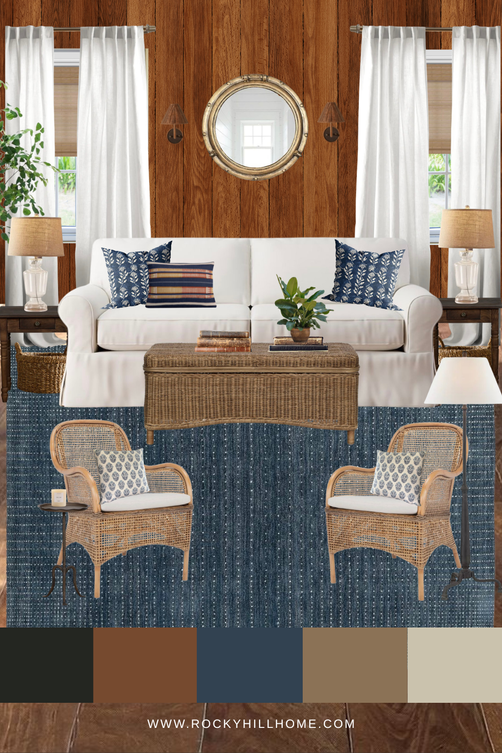
Old Cape Cod Style: Eclectic Coastal Living Room Mood Board
This eclectic coastal living room mood board blends old Cape Cod charm with warm wood tones, navy accents, woven textures, and relaxed cottage style. Perfect inspiration for a cozy lake house, cabin, or timeless New England-inspired home.
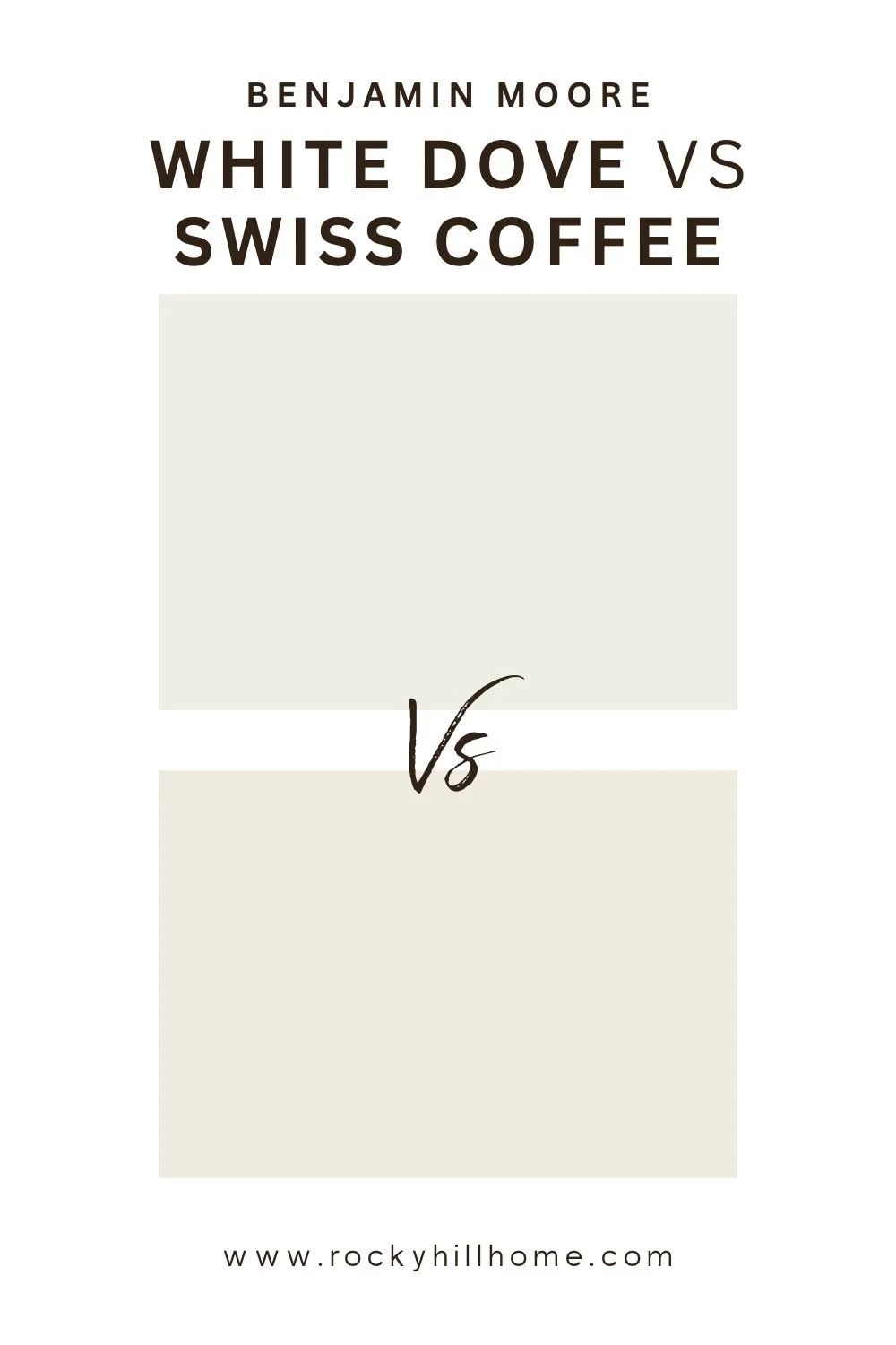
Swiss Coffee vs White Dove: Which One Is Right for You?
Trying to choose between Benjamin Moore Swiss Coffee and White Dove? This guide compares undertones, warmth, brightness, trim pairings, kitchen cabinets, and whole-house use so you can pick the best warm white paint color for your home.
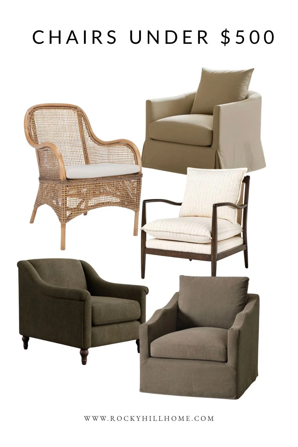
Best Accent Chairs Under $500 (Cozy Transitional Style)
These are the best accent chairs under $500 for a cozy transitional home. From wood frame chairs to slipcovered swivel chairs and woven accent seating, these affordable picks look timeless, warm, and designer-inspired.
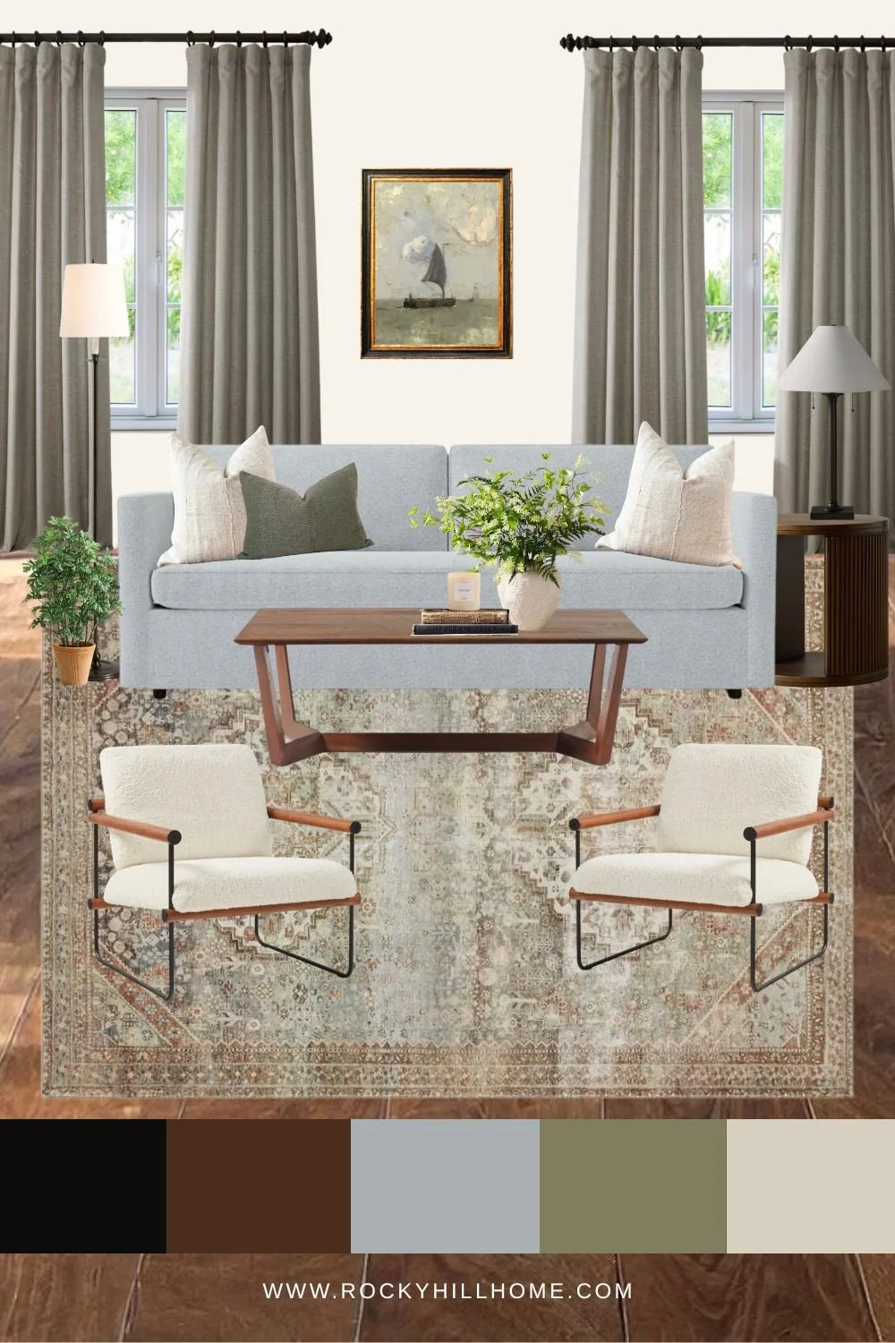
Small Cozy Living Room Layout + Mood Board
Looking for small cozy living room ideas? This warm Modern Traditional mood board and layout guide shares furniture placement tips, layered neutral styling, cozy decor inspiration, and space-saving design ideas for creating a beautiful small living room.
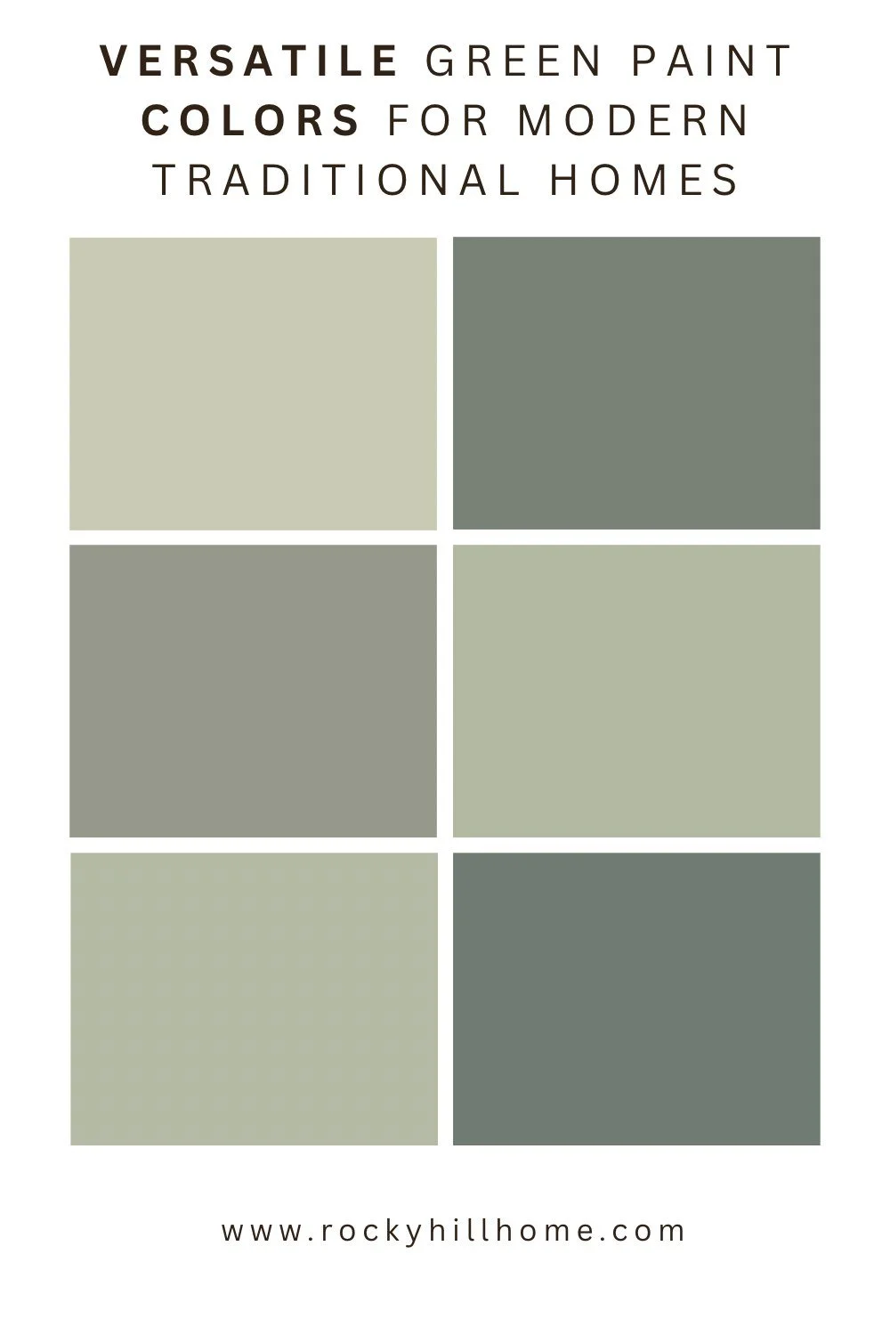
The Most Versatile Green Paint Colors for Modern Traditional Homes
Looking for the perfect green paint color? These versatile green paint colors work beautifully in modern traditional homes, pairing effortlessly with warm neutrals, wood tones, and layered interiors for a timeless, collected look.