Spotted: The Ice Blue and Dark Red Trend Bubbling Under the Surface
This article contains affiliate links.
The Trend Sighting: Fresh and Sharp
Browsing Pinterest for home inspo, or taking in the lasted fashion, you may have noticed the emergence of a fresh and interesting color combo, ice blue and dark red.
This color pairing takes the standard “Americana” combination of red and blue and turns it on it’s head. Think of the blue as running towards the light, while the red runs towards the dark. The contrast becomes so sharp that the palette itself takes on a whole new identity.
As I wrote about at the end of last year, the “quiet luxury” palettes of cream, stone, and tan, are fading into the background as more color personality fills our homes and closets. These colors tend to rooted in the past, and this one is no different with it’s nod to mid-century design, but the ice blue and dark red color combination also feels like it’s looking strait into the future. It’s almost experimental, daring, yet somehow not too crazy. The “cool girl” of color palettes, if you will.
Why It’s Bubbling Up Right Now
As you know, trends don’t happen in a vacuum, and not all trends are “trendy”. Some trends end up defining an entire decade. Some an entire design movement. But to understand why light blue and dark red are showing up in mainstream events like the Super Bowl Half Time performance, we have to go back a few years.
The Fashion to Home Pipeline:
With the risk of sounding like Miranda Priestly in The Devil Wears Prada, the runway is the ultimate crystal ball for everything design. Ok, this is definitely going to sound like Miranda, but go with me here. Over the last few fashion cycles, we’ve seen major design houses using merlot leathers and sheer blues. As these colors make their way through to the stores, interior designers start picking it up, and before you know it, it’s in your social media feed.
The Evolution of the "Unexpected Red"
Which brings me to the unexpected red theory. To remind you, the unexpected red theory was a micro trend in 2025 that said adding a pop of red into an interior can reinvigorate a design. In the end, this little trend was more than just a social media flash in the pan, it was a taste of what was right around the corner. We’ve now moved towards more structure in red’s placement and to make it pop even more, we are pairing it with a contrasting color, using light blue to fill the negative space instead of white or beige.
The Post-Minimalist Pull
Things got so quiet in interior design over the last 10 years, that it’s only natural that we would swing the other way. We want to experiment with color. We want to have fun! And let’s not beat around the bush, the world is a dumpster fire. We want joy in the few things we can actually control. In the kitchen above you can feel emotional pull of the small vase of red flowers and dark reddish brown vintage books propped against the light blue shelving. It provides a cool-toned calm with hints of a dark, romantic warmth.
The Anatomy of the Combo: A Study in Contrast
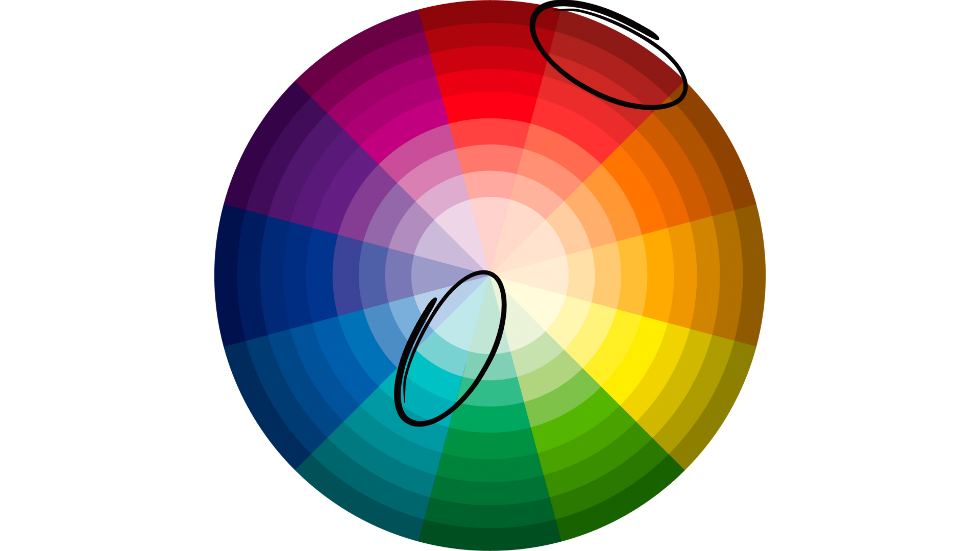
Looking at the color wheel above, you can see why this contrast is so dynamic. Blue-green and red-orange are complementary colors, sitting opposite each other on the color wheel, and creating high contrast between them. At the same time, ice blue and dark red are different values. Meaning, ice blue is blue-green with white added, and the dark red is red-orange with black added.
Similar to how black and white interact with each other, desaturated blue-green functions as the neutral negative space, while the dark red acts as a strong accent. Imagine this shower below with only pale, ice blue tiles. On its own, it’s pretty and, well, fine enough. But with these gorgeous dark red tiles as an accent? Wowza, this is a special space with personality and depth.
Ways to Adopt the Look
If the ice blue and dark red color combo speaks to you, there are many ways to bring it into your home. When shopping for wood pieces, stick to dark red-orange tones like walnut in order to add the dark red into your color palette in a more subtle way that will outlast trends. Or, you could go smaller and add a piece of art and some throw pillows. And if you love, love, love it, go big. The tile inspiration above is to die for. Don’t be afraid to make your home a reflection of who you are.
Shop Ice Blue and Dark Red

Anthropologie, Alva Floral Cotton Velvet Pillow

Pottery Barn, Printer’s Desk

360 Lighting, Ryan Table Lamps Set of 2

Quince, Cotton Velvet Oversized Lumbar Pillow Cover

Anthropologie, Channel-Tufted Occasional Chair in Whisper Velvet

Anthropologie, Miniature Rose Still Life Wall Art