The Heritage Palette: 5 Color Trends for a Modern Traditional Home in 2026
Your Confident Guide to Timeless Hues
This article contains affiliate links.
There is nothing quite like the start of a new year to get your design gears turning. Here on the blog, I’m all about helping you create homes with soul, spaces that feel collected, classic, and completely your own. If your personal style is Modern Traditional and Heritage-inspired, then the color forecast for 2026 is feeling like a gift.
After years of light, bright, and often cool-toned neutrals, the industry has been calling for a major shift for a few years now. The biggest trend we’re seeing is a continued march towards deep, comforting, saturated, and storied colors. We’re moving away from the stark and into the soothing, finding warmth, stability, and a little bit of beautiful drama.
This is the perfect moment to design with confidence, using color to highlight your home’s character, create character where there is none, and ground your modern updates in timeless elegance.
This is just the start of our 2026 Color Trend series, but here is a sneak peek at the five major color stories we'll be diving into, and how you can begin to integrate them into your Modern Traditional aesthetic.
Related Post: 12 Interior Design Trends for 2026 to Get Excited About: Tons of Character, More Color, Lots of Style
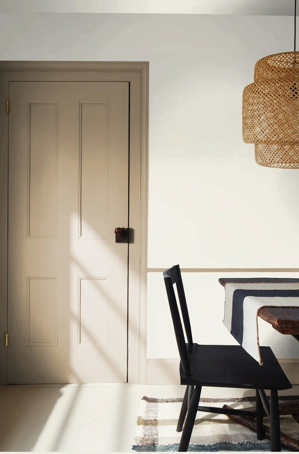
1. The Anchoring Neutral: Universal Khaki and Tailored Tan
Forget the cool taupes and pure whites; the foundational neutral for 2026 is wrapped in warmth and history. Sherwin-Williams’ Color of the Year, Universal Khaki (SW 6150), embodies this perfectly. This trend also embraces richer tan variations like Sherwood Tan (BM 1054).
These are tailored, timeless colors that sit somewhere between a warm taupe and a soft brown, lending an air of comfort. It is a neutral with gravitas.
How to Use It: This is your new whole-home color palette’s mid-toned neutral. It provides a beautiful, earthy canvas for layered textures and patterned textiles. Try it in a living room to create a cozy vibe, or use it on interior doors and trim for an unexpected contrast.
Sherwood Tan via Benjamin Moore
Shop Khaki and Tan
Scroll right for more

2. Deep, Moody Comfort: Rich Oxblood, Damson, and Tailored Browns
The trendiest dark colors of the year aren't black or navy; they are deeply saturated, moody hues that evoke the romance of an old-world library or a jewel box interior. Think rich burgundies, oxblood reds, and deep purple-grays, like Warm Mahogany (PPG1060-7) or Benjamin Moore's Color of the Year, Silhouette (AF-655).
We're also embracing sophisticated, near-black tailored browns such as Benjamin Moore Wenge (AF-180). These shades are expressive without being loud, bringing a powerful sense of intimacy and sophistication while providing a historic anchor.
How to Use It: These colors are stunning for small, dedicated spaces that crave atmosphere—a powder room, a study, a bedroom, or a dining room where you want to linger. Paint all four walls, or color-drench the built-ins and trim in the same shade for a cohesive, dramatic moment. For a subtle approach, use a deep brown like Wenge on just the interior doors throughout the home to add beautiful weight and architectural contrast.
Related Post: Moody Paint Colors for a Cozy Transitional Bedroom
Shop Moody Comfort
Scroll right for more
3. The Soft Anchor: Creamy, Layered Whites
Even with the rise of color, a refined white will always be essential. But the whites of 2026 are softer, creamier, and warmer, moving away from anything that feels sterile. These hues create the light, lifted feeling we love while harmonizing with the warmer tones in the rest of the palette. Try the Benjamin Moore classics Swiss Coffee OC-45 or White Dove OC-17.
How to Use It: Use these soft whites liberally on trim, millwork, and ceilings. When paired with the deeper shades on the walls, they provide that crisp, high-contrast look that is a hallmark of Modern Traditional design. They are the perfect foundation for a bedroom, creating a calming, serene retreat. Paint your walls BM Alabaster OC-129, and layer in color with your textiles and decor.
Related Post: How to Choose the Perfect White Paint Color for Your Walls
Shop Whites
Scroll right for more
4. Heirloom Greens & Teals
Greens are continuing their moment, but they’ve matured into sophisticated, heritage-inspired hues. We’re seeing a shift to mossy, earthy greens and deep, saturated teals, like Benjamin Moore's Narragansett Green (HC-157) and Nantucket Gray (HC-111). These colors feel familiar, organic, and beautifully classic, reminiscent of English countryside homes.
How to Use It: This is a spectacular choice for kitchen cabinetry, giving a timeless, custom-built look. It’s also gorgeous in an entryway or mudroom, offering a welcoming, grounding first impression that links the interior to the natural world outside.
Shop Heirloom Green and Teal
Scroll right for more
5. Tranquil Heritage: Muted and Dusty Blues
The final key to the 2026 palette introduces a beautiful sense of serenity and quiet history. We are seeing a strong embrace of muted and dusty blues. Colors that recall antique ceramics, faded linen, and traditional watercolor paintings. These are not bright coastal hues, but soft, refined blues like Benjamin Moore Smoke (2122-40).
These colors provide a refreshing contrast to the warmth of the Khakis and Earth Tones, offering a sophisticated calm that feels instantly familiar and comforting.
How to Use It: These tranquil blues are perfect for spaces dedicated to rest and retreat, making them an ideal choice for bedrooms, guest rooms, or reading nooks. Try using a soft dusty blue on lower shiplap or doors for a touch of architectural charm, or introduce it through large anchor pieces like a velvet sofa or area rug to bring a subtle, classic coolness to your room.
Shop Soft Blue
Scroll right for more
Your Next Step: Designing with Confidence
The 2026 color trends are an invitation to create a home with more depth, personality, and comfort. They align perfectly with our Modern Traditional niche, celebrating heritage while keeping things fresh and refined.
Over the next few weeks, we’ll be diving deep into each of these five color stories, complete with specific paint names, designer pairings, and room-by-room inspiration so you can tackle your next project with absolute confidence.
Which of these five color stories are you most excited to explore in your home?