Gray Floors, Warm Home: How to Curate a Cozy Color Palette for Cool Flooring
This article contains affiliate links.
Gray flooring was a dominant trend in renovations and new home builds for over a decade. While it offers a sleek, modern, and neutral foundation, it presents a unique challenge: How do you stop a room with gray floors from feeling cold, sterile, or industrial?
The secret isn't to fight the gray, but to bridge it.
Using the mood board below as our guide, we will break down exactly how to build a color palette that brings warmth, depth, and sophistication to a room with cool-toned flooring.
PIN to Save for Later
The Challenge: The "Floating" Furniture Effect
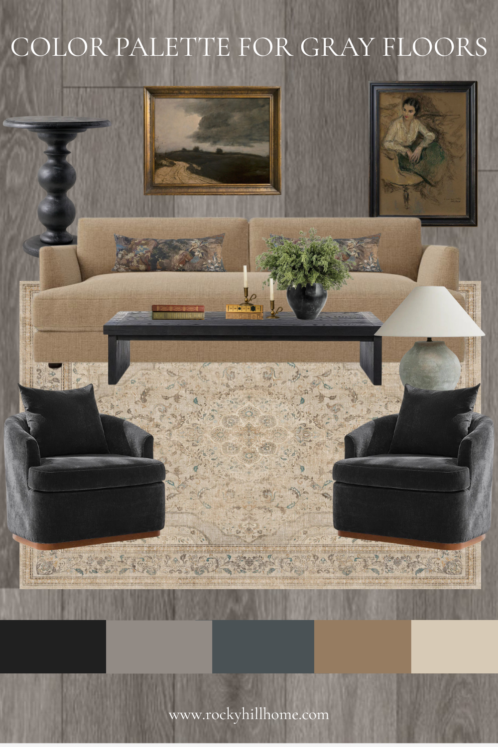
When you place warm-toned furniture (like oak tables or beige sofas) directly onto cool gray floors without a buffer, they often clash. The warm and cool tones repel each other, creating a visual disconnect where the furniture feels like it is "floating" rather than belonging.
To fix this, you need a connector. In our example mood board, that connector is the rug.
Related Post: Best Rugs for Gray Floors: How to Choose the Perfect Style, Color & Pattern
The Solution: The "Bridge" Rug Strategy
Look closely at the rug in the mood board. It is the single most important element in this design scheme. Here is how it functions as the anchor for the entire room:
The Base Tone: The rug doesn't match the floor; instead, it contrasts it. The base color is a warm Cream/Beige (matching the far-right swatch). This immediately covers the "cool" floor with a layer of "warmth."
The Thread: If you look at the pattern in the rug, you will likely see subtle hints of charcoal or slate blue woven into the traditional design. These small flecks of cool color "speak" to the gray floor, acknowledging it exists, while the dominant beige color "speaks" to the sofa.
The Transition: By placing the Camel/Tan sofa on top of this beige rug, you create a seamless gradient of warmth. The eye moves from the gray floor $\rightarrow$ to the beige rug $\rightarrow$ to the camel sofa. The transition is soft rather than jarring.

Deconstructing the Palette: Why This Mix Works
The color swatches at the bottom of the image provide a perfect "cheat sheet" for this aesthetic. Let’s break down why this specific combination creates a high-end, cozy look.
1. The Grounding Dark Neutrals (Black & Slate)
Swatches: Black (Far Left) & Slate Blue-Gray (Middle)
Role: Contrast and Drama.
In the Room: Notice the velvet charcoal accent chairs, the black coffee table, and the dark pedestal side table.
Why it works: Gray floors can sometimes look "washed out." Adding deep, saturated blacks or dark charcoals acts as punctuation marks in the room. They provide definition and prevent the beige and gray from blending into a muddy mess.
2. The Bridge Color (Taupe/Greige)
Swatch: Taupe (Second from Left)
Role: The Mediator.
In the Room: This tone is found in the lamp, the background of the artwork, or the secondary patterns in the rug.
Why it works: Taupe sits right in the middle of gray and brown. It effectively marries the two distinct temperatures of the room.
3. The Warmth Injectors (Camel & Cream)
Swatches: Camel/Brown (Second from Right) & Cream (Far Right)
Role: Coziness.
In the Room: The sofa, the negative space in the rug, and in the artwork.
Why it works: This is where the "home" feeling comes from. If you removed the camel sofa and replaced it with a gray one, the room would instantly feel colder. By choosing a sofa in a warm, toasted almond or camel shade, you counterbalance the visual temperature of the floor.
3 Quick Tips for Your Gray-Floored Room
Based on this visual, here are three rules to follow when shopping for your space:
Mix Your Metals: Don't feel stuck with silver just because the floors are gray. Notice the gold/brass frames on the artwork? Gold is a warm metal. It pops beautifully against gray walls or floors and adds an instant layer of "sunshine" to the space.
Texture is King: Gray wood-look floors can feel hard and flat. Counteract this with plush textures. The mood board uses velvet chairs, a linen-like sofa fabric, and a soft traditional rug. These soft textures absorb sound and soften the harshness of the floor.
Don't Match the Walls to the Floor: If your floors are cool gray, avoid painting your walls a matching cool gray. Opt for a "Greige" or a warm off-white (like the BM Swiss Coffee).
Final Thoughts
Gray floors are not a design sentence to live in a cold environment; they are a neutral canvas waiting for warmth. By using a rug to bridge the gap and introducing rich camel and black tones, you can create a space that feels curated, intentional, and deeply inviting.
I hope this article gave you the inspiration you need to transform your home!