How to Use the 60-30-10 Rule to Design the Perfect Blue Color Palette
This article contains affiliate links.
Blue may not always be trending, but it’s always popular. To me, it’s one of the most versatile colors there is, but it does take thought and planning to get the feeling you want for your space. Too much of the same shade of blue will look flat, and without a set color palette, your blue will look like an afterthought. Like a painter just threw an indigo splotch in the middle of a green landscape.
Enter the 60-30-10 design principle. You may have heard this color palette technique before. The simple formula is this: 60% of your room will be you’re dominant color, 30% will be your secondary color and 10% will be your accent. You can implement your dominant color in your walls and upholstery, but basically it’s the most obvious color in the room. Your secondary color supports the dominant color in accent furniture, rugs, and curtains. The accent color is your pop. It shows up in artwork, throw pillows and decor. Let’s see it in action using blue as different percentages of the color palette.
Articles You May Like
60-30-10 Guide to Transitional Blue Palettes
60% Blue, 30% Yellow, 10% Ivory

60%: This transitional blue mood board uses multiple shades of blue in the gray-blue sofa, navy accent chair, slate blue curtains, as an accent in the rug’s color palette, accent in a throw pillow, the art, and vase.
30%: The yellow in this palette shows up in the rug, and decor. Woven baskets and antique gold frames are a wonderful way to add yellow hues and texture in blue interior design.
10%: Sprinkled through the living room design are pops of ivory in a toss pillow, lamp shade, and marble bowl.
Shop This Color Palette
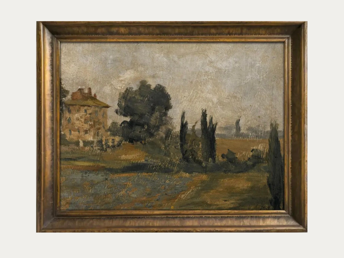
Millsworth Art, Vintage Countryside Landscape
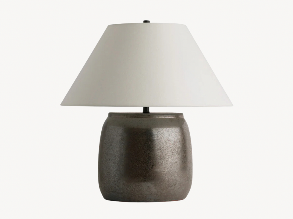
Amber Interiors, Sochi Table Lamp
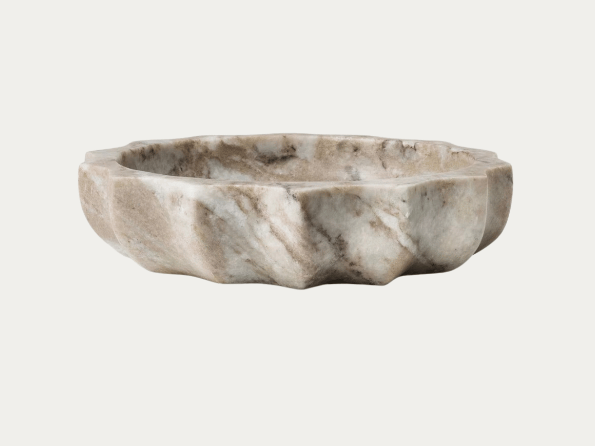
Threshold, Marble Catchall
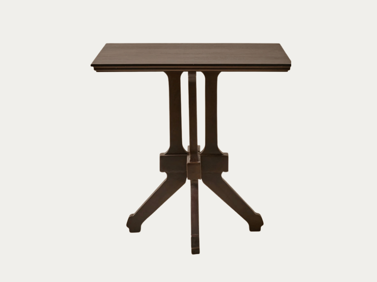
Magnolia, Amelie Vintage Inspired Side Table
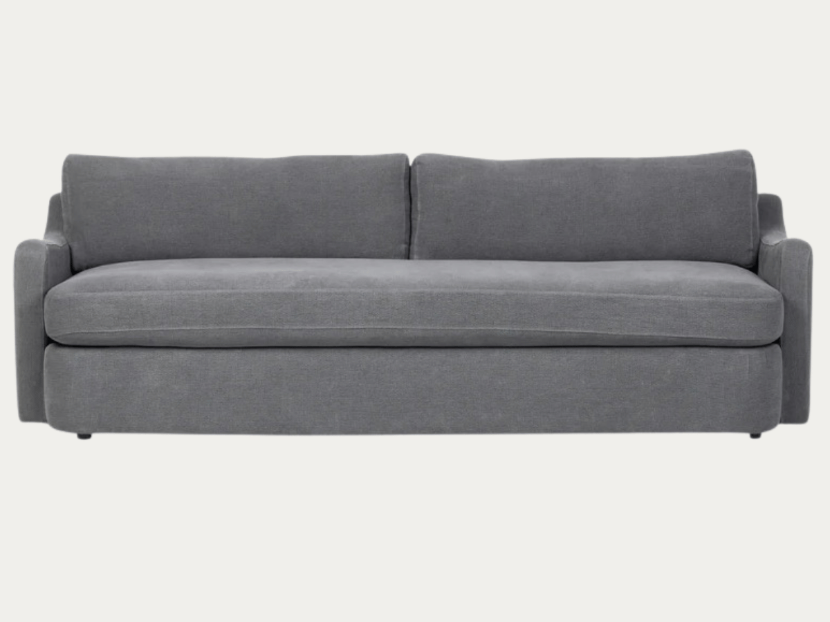
Amber Lewis x Four Hands, Aurelia Sofa
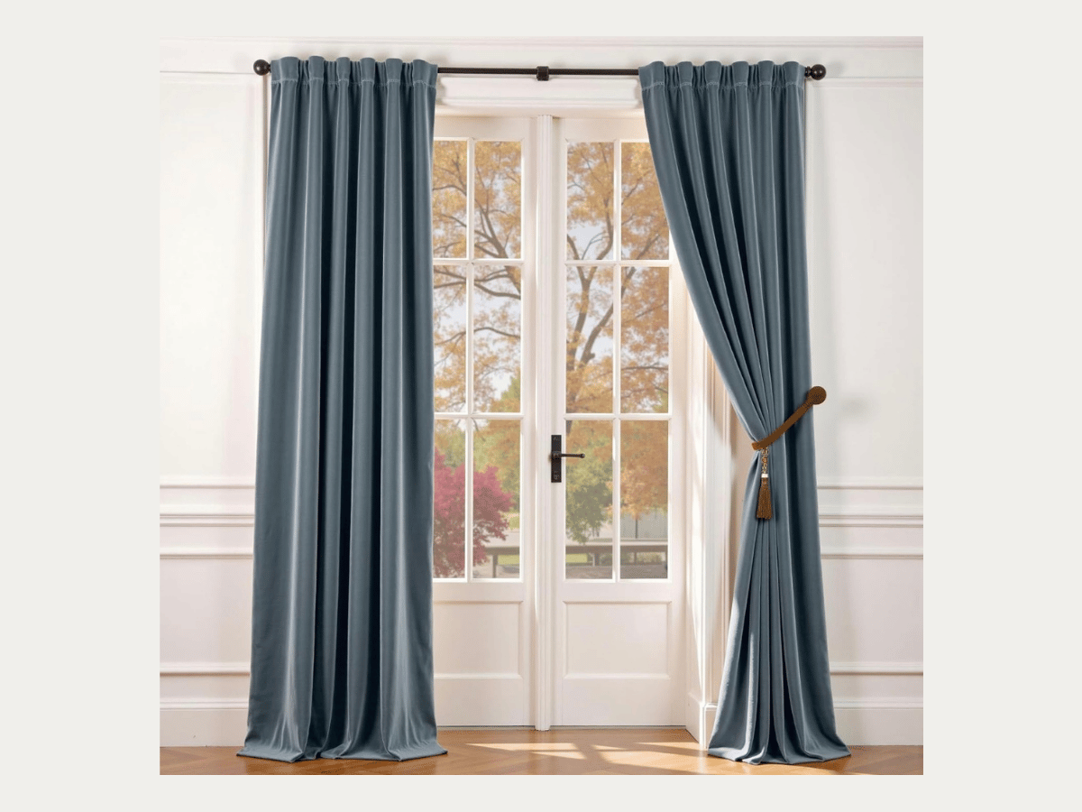
Lazzy, Blue Velvet Curtains
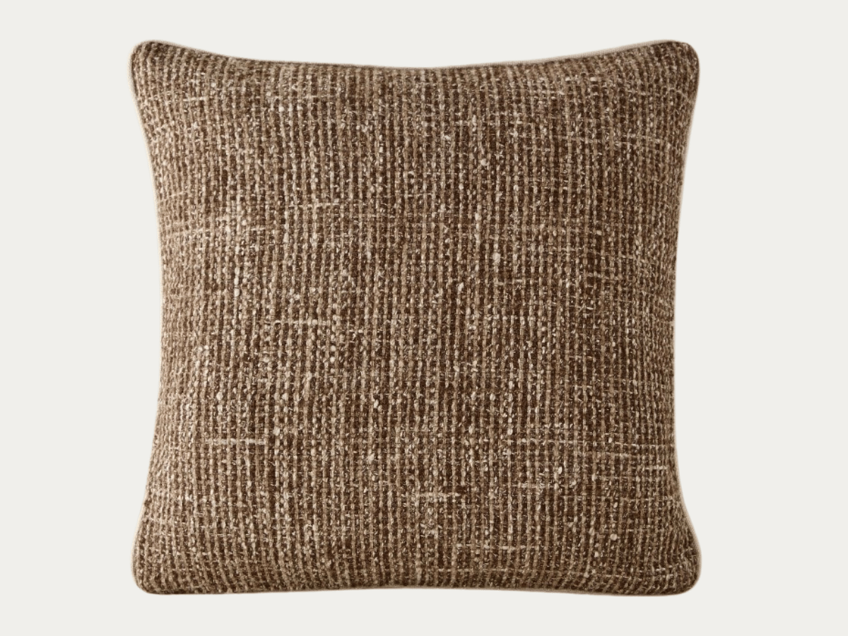
Aimee Song, Enzi Pillow
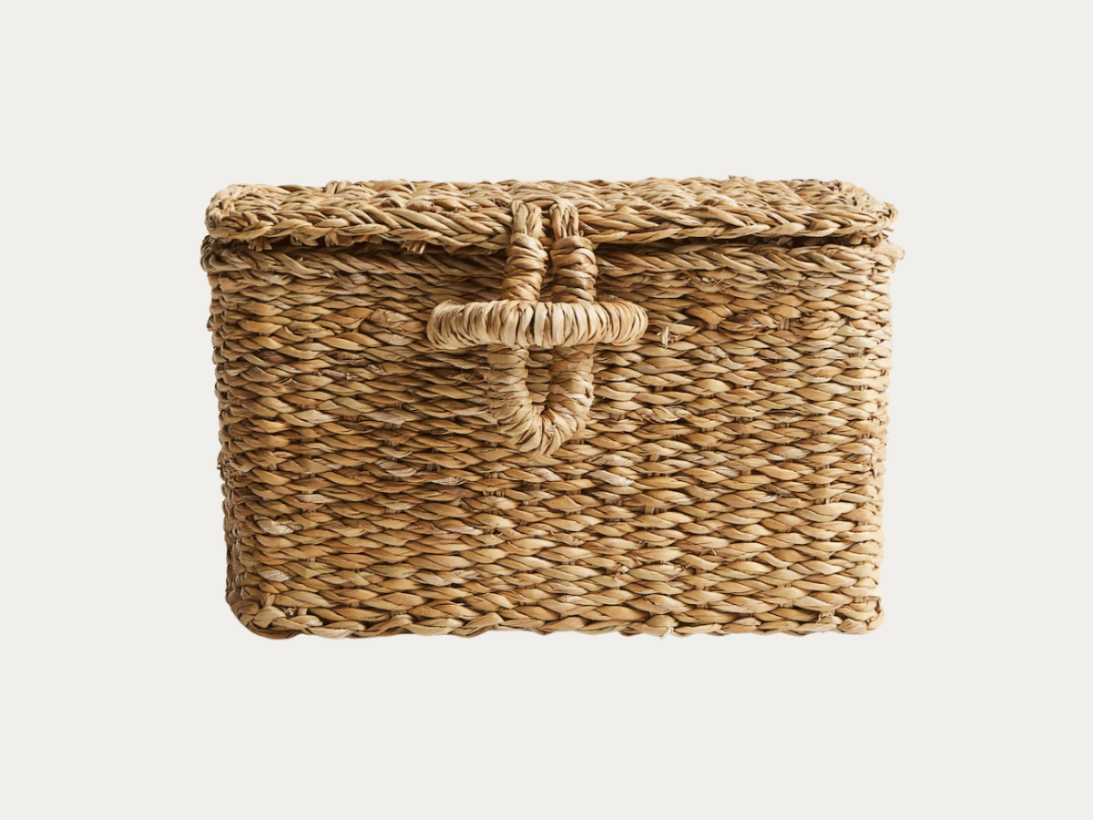
H&M, Seagrass Storage Basket with Lid
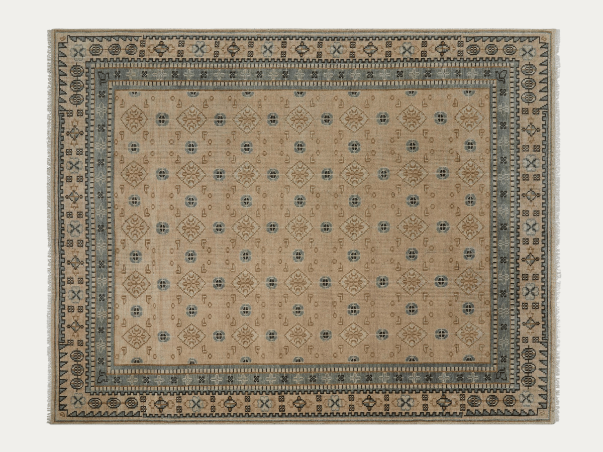
Lulu and Georgia, Hirsh Hand-Knotted Wool Rug
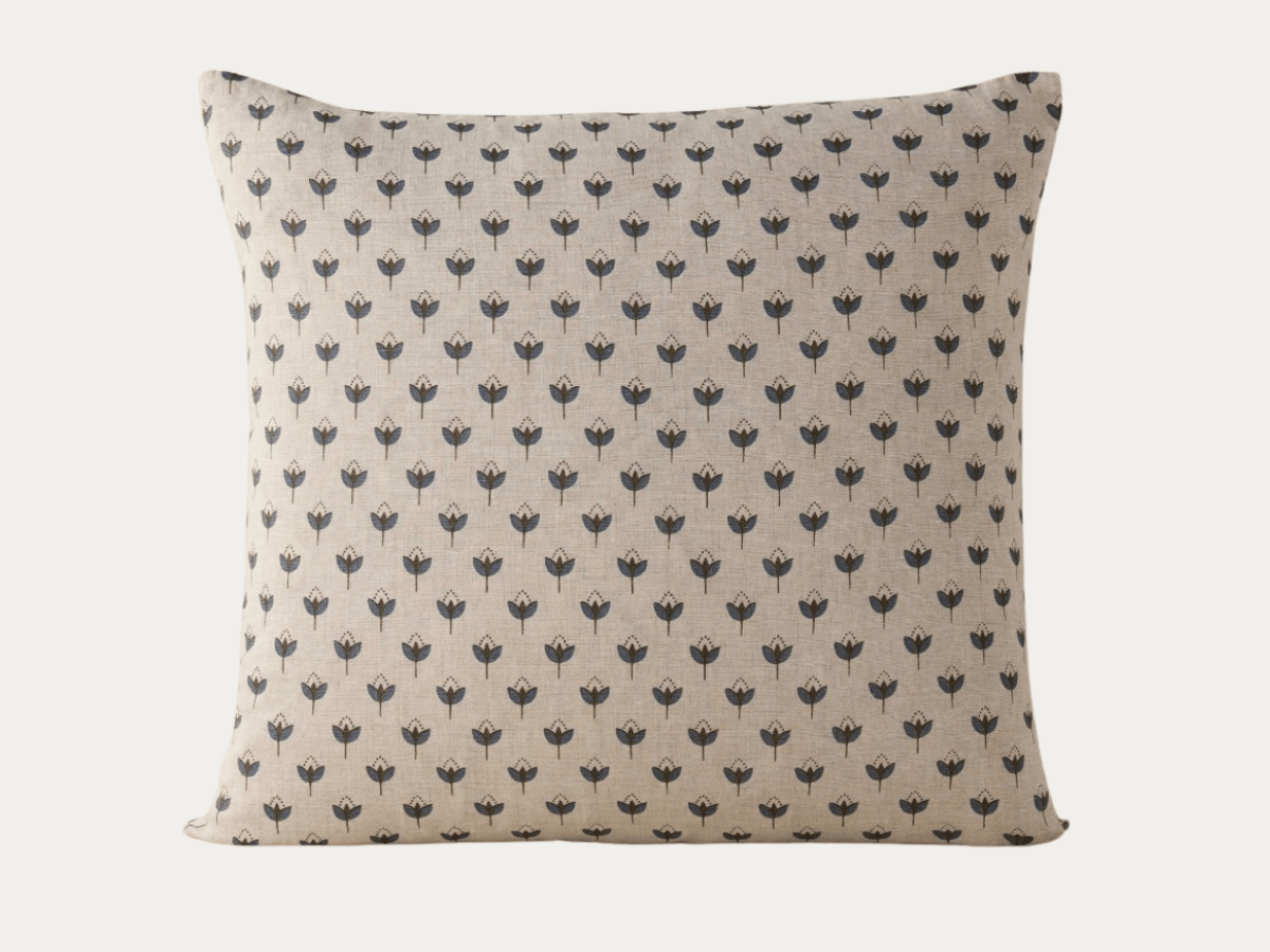
Lulu and Georgia, Poiret Linen Pillow
McGee & Co,
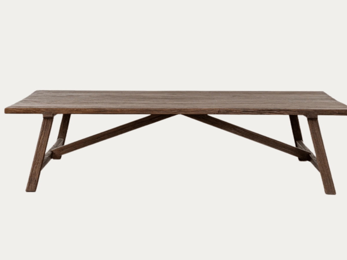
Lockwood Coffee Table
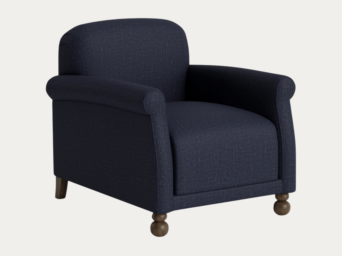
Heidi Caillier, Paley Accent Chair in Navy Performance Linen
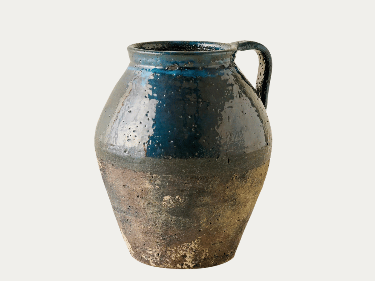
Magnolia, Jasper Artisanal Jug Vase
60% Neutrals, 30% Blue, 10% Red

60%: A warm neutral base for blue color schemes is perfect for neutral design lovers who are drawn towards a more subtle use of color. “Neutral” here includes, shades of white, tan and black.
30%: The blue in this bedroom mood board is found in the lamp, bed blanket (which should be folded at the end of the bed), floral printed lumbar pillows, and as an accent in the rug.
10%: The vintage red rug is the only hit of red needed to make a statement.
Shop This Color Palette
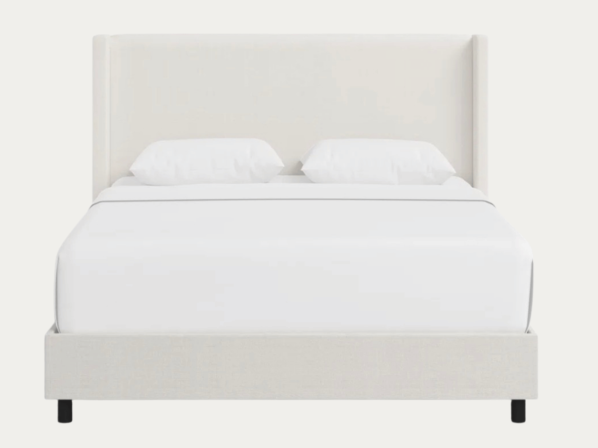
Joss & Main, Tilly Upholstered Bed
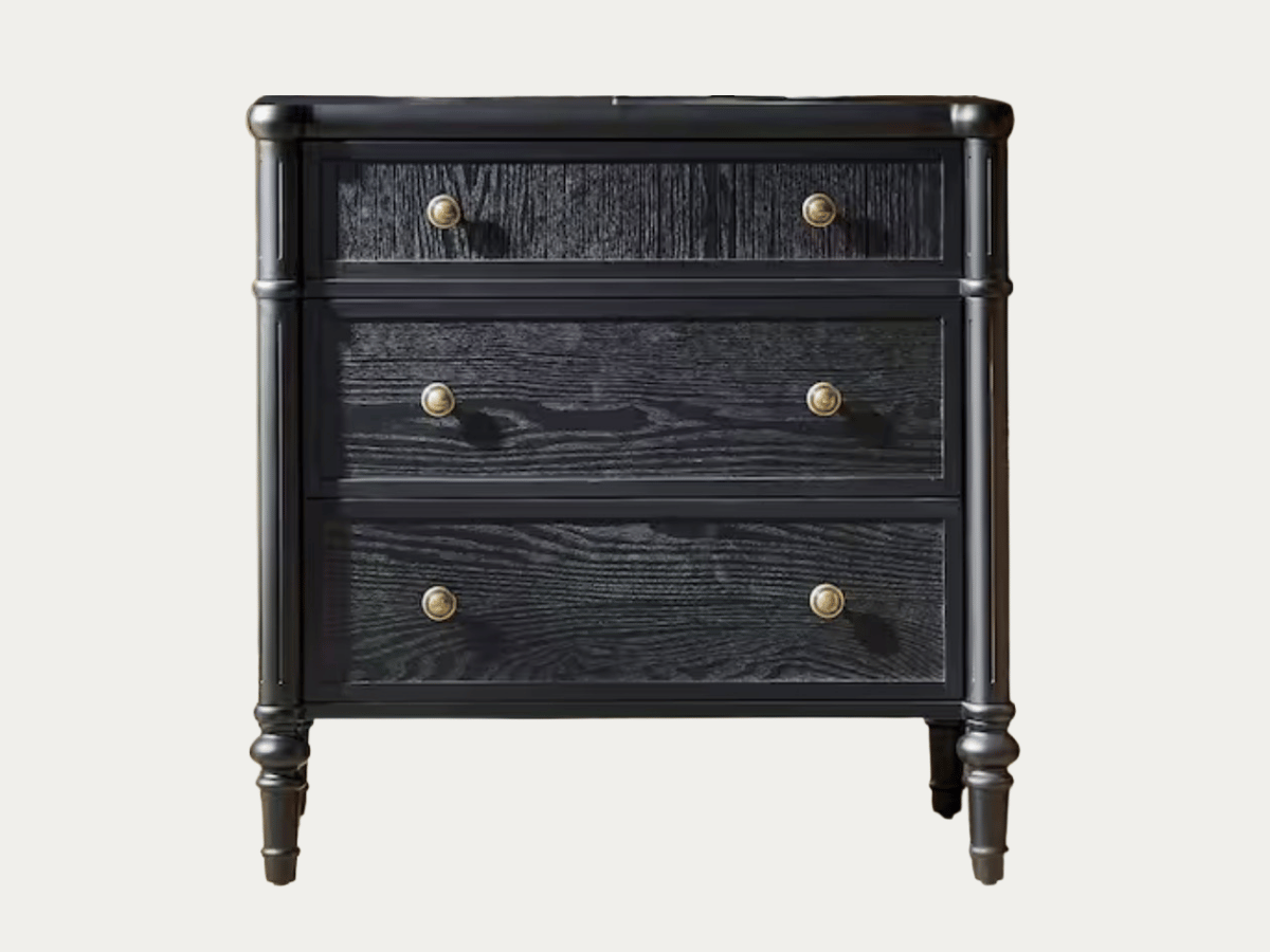
JAYDEN CREATION, Roland Black 3-Drawer Nightstand
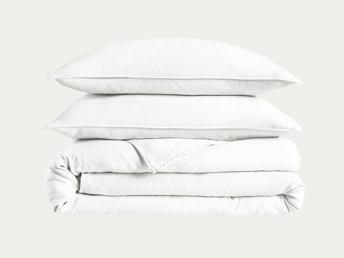
Brooklinen, Bedding
Duvet Priced by Size, Sheets Priced by Size at Brooklinen
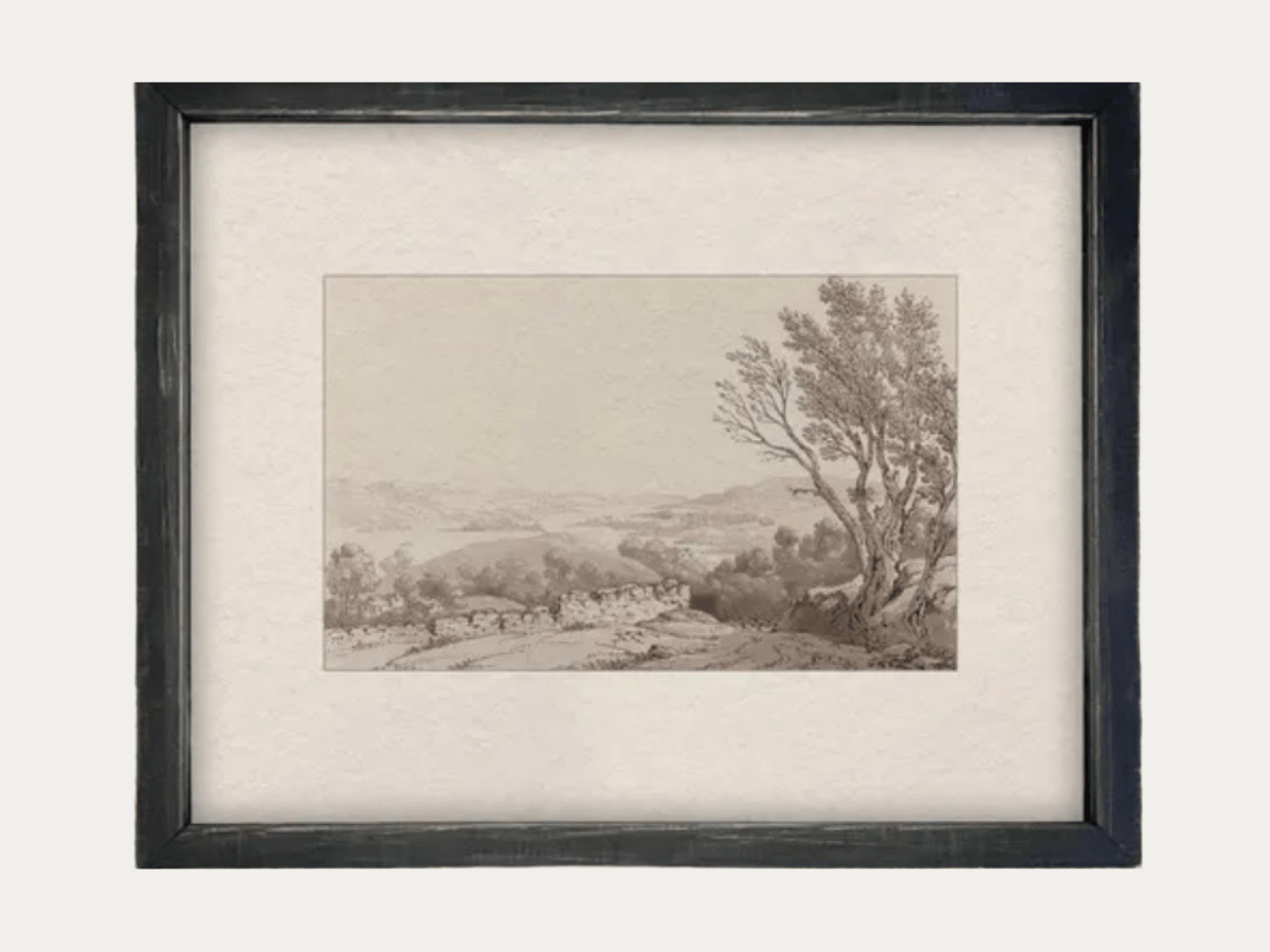
Linen and Cloth, Vintage Country Landscape
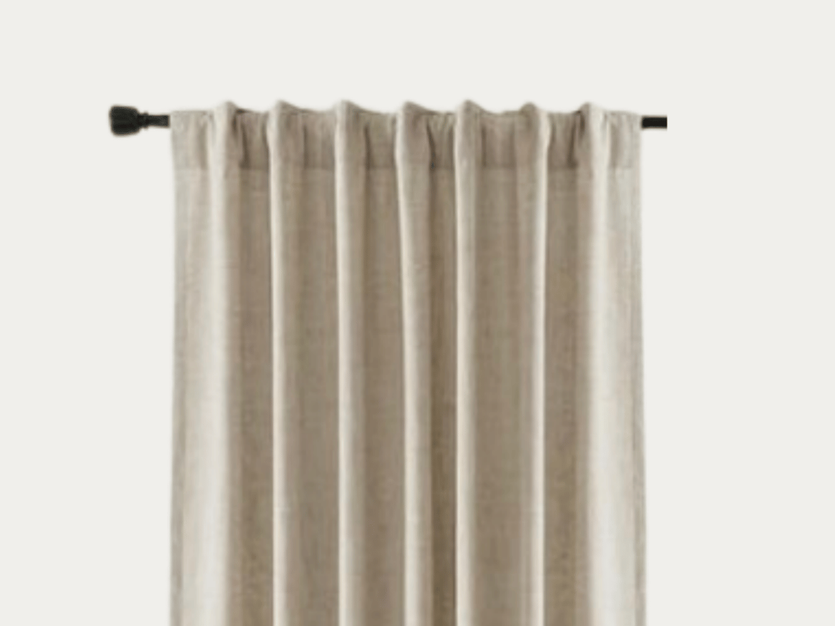
NICETOWN, Blackout Cream Linen Curtains
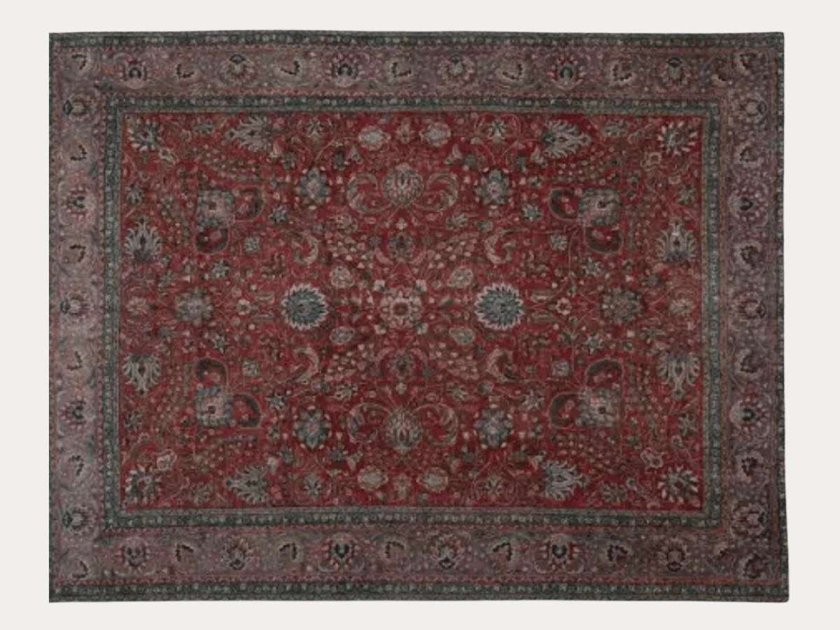
One of a Kind, 10' X 12' Vintage Persian Rug
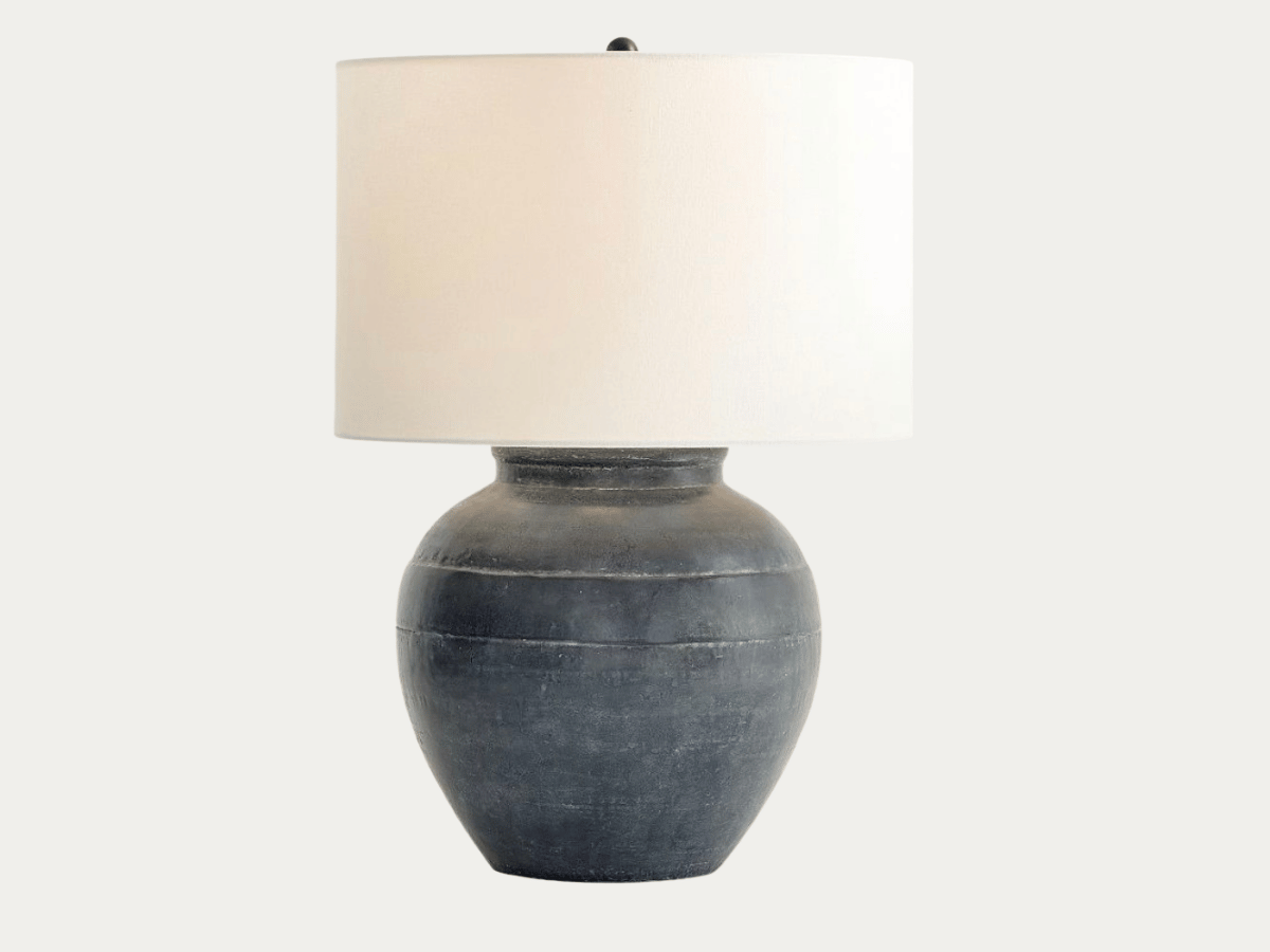
Pottery Barn, Faris Ceramic Table Lamp
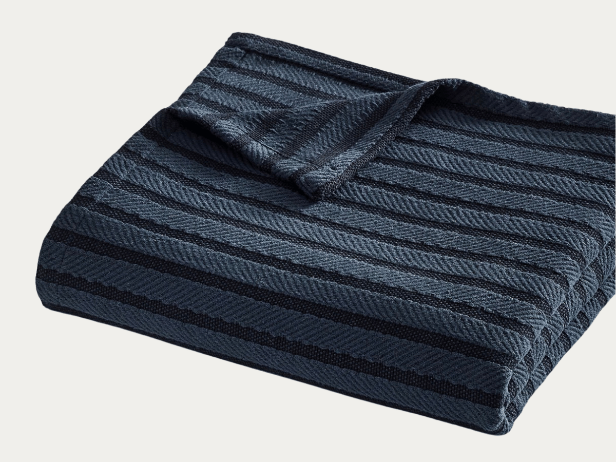
Pottery Barn, Cable Stripe Blanket
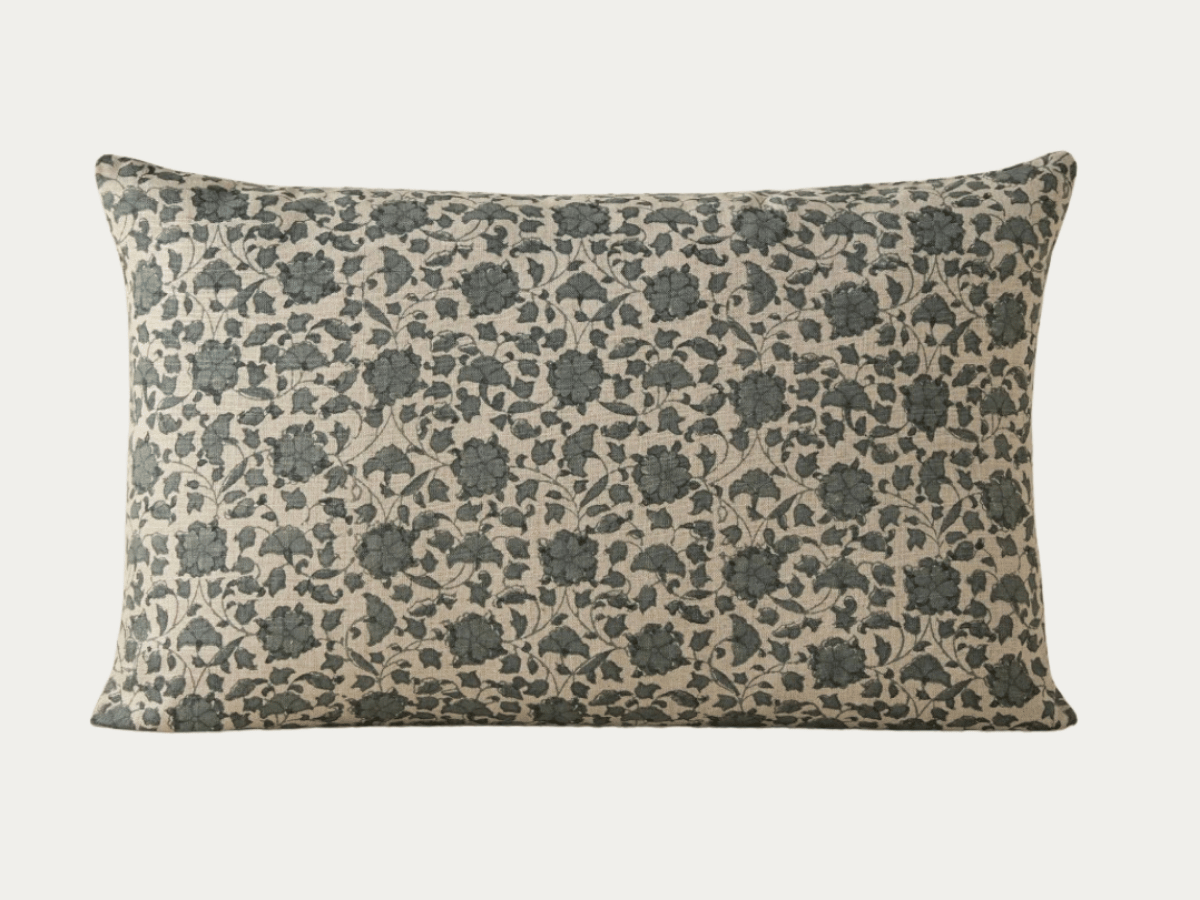
Lulu and Georgia, Lavelanet Linen Pillow
How Do I Make a Blue Room Feel Warm?
To make a blue room feel warm, the 60-30-10 rule is a great guide. First, decide how much blue will be in your color palette. Will it be your dominant color, secondary color, or accent? While blue is a cool, “receding” color, you can create a cozy color palette by adding an “advancing” warm contrast and texture. For instance, if you choose a 60% blue living room with dusty blue walls and navy sofa, you can add 30% ivory through the rug and curtains to warm it up. Or if you want blue to represent 30%, warm ivory can be the dominate color in your living room.
And of course, the easiest way to warm up any room is with warm wood. Dark or light, warm toned wood grounds a blue color palette by bringing in that much needed warm color and natural texture. Balancing your “receding” blues with “advancing” warm elements, you create a space that feels anything but cold.
Shop More Rocky Hill Home Mood Boards