Universal Khaki & Sherwood Tan: Your Guide to the New Khaki and Tan Neutral Color Trend
2026 Color Trend Series
This article contains affiliate links.
The reign of cool-toned grays and stark whites is officially over. If you haven’t transitioned yet, this is the time. For 2026, the color conversation has continued to move back to Earth, embracing a palette of warm, grounding neutrals that offer comfort and sophistication. Leading this movement are the quintessential mid-toned neutrals: khaki and tan.
Specifically, two colors are setting the foundation for this heritage-inspired trend: Sherwin-Williams Universal Khaki (SW 6150) and Benjamin Moore Sherwood Tan (1054). Far from the minimalist beige we’ve seen in tonal interiors over the last few years (which has been called “sad beige”, and unfairly so in my opinion!), these shades are used as the backbone for a layered, luxurious, and authentically lived-in home.
The Foundation: Universal Khaki (SW 6150)
Sherwin-Williams’ Universal Khaki is a standout for a reason. This mid-tone neutral balances a soft yellow-green undertone, giving it a sophisticated complexity that a simple beige lacks.
The Vibe: Universal Khaki is the color of classic, tailored elegance, think well-worn leather, linen suits, and sun-drenched pottery. It's an easygoing shade that brings immediate warmth and a sense of cohesion to an open-concept floor plan.
Why It Works: Its subtle green undertone prevents it from turning too yellow or pink, making it incredibly versatile. It works beautifully with natural wood tones (like oak and walnut), as well as dark bronze and brass accents.
Design Tip: Use Universal Khaki on all four walls in a main living area to create a calming, continuous flow. Contrast it with crisp, warm white trim (like Sherwin-Williams Alabaster) to keep the look clean and updated, or color drench by using an eggshell sheen on the walls, and semi-gloss on trim and doors.
The Earthy Counterpart: Sherwood Tan (BM 1054)
While Universal Khaki leans toward a classic khaki, Benjamin Moore’s Sherwood Tan is a warm, rich tan that harkens back to nature and historical depth. Part of the Historical Color Collection, this shade offers depth and a comforting, rooted presence.
The Vibe: Sherwood Tan has an antique, organic feel. It evokes sun-baked adobe, aged parchment, and the natural tones of unprocessed wool. It is deeper and more saturated than many contemporary tans.
Why It Works: With an undeniable warmth, Sherwood Tan acts as a grounding force. It's a wonderful choice for creating a cozy, cocoon-like atmosphere in a bedroom or a sophisticated, moody dining room.
Design Tip: Paint the walls in Sherwood Tan and pair it with white wainscoting or millwork for a handsome, high-contrast traditional look. It also makes for a stunning color choice on kitchen islands, mudroom cabinets, and doors.
Layering the Look: Khaki and Tan Beyond the Paint Can
The new neutral trend isn't just about paint; it's about integrating these earthy tones into your entire interior color palette. Decorating with khaki and tan is the key to achieving the layered, "quiet luxury" look that dominates 2026 design.
1. Texture and Textiles
Khaki and tan are at their best when layered in natural materials. Use these colors to add rich texture without introducing overwhelming pattern.
Living Room: Swap your cool gray throws and pillows for chunky, natural linen, raw silk, and textured bouclé in varying shades of tan and ivory. Introduce a jute or sisal area rug underfoot.
Bedroom: Use tan and khaki on bedding in rich textures like washed velvet, organic cotton, or a soft, lightweight wool throw.

2. Upholstery and Furniture
Consider the new neutrals for your anchor pieces. A sofa upholstered in a khaki-colored linen or a set of dining chairs in a classic tan leather instantly grounds a space.
Update an Established Palette: If you have blue or deep green walls, introducing a khaki velvet accent chair or a tan wooden storage cabinet will bridge the gap between your established color and the new, warmer trend.
3. Complementary Colors: The Perfect Pairing
The versatility of khaki and tan allows them to harmonize beautifully with both existing cool and warm palettes.
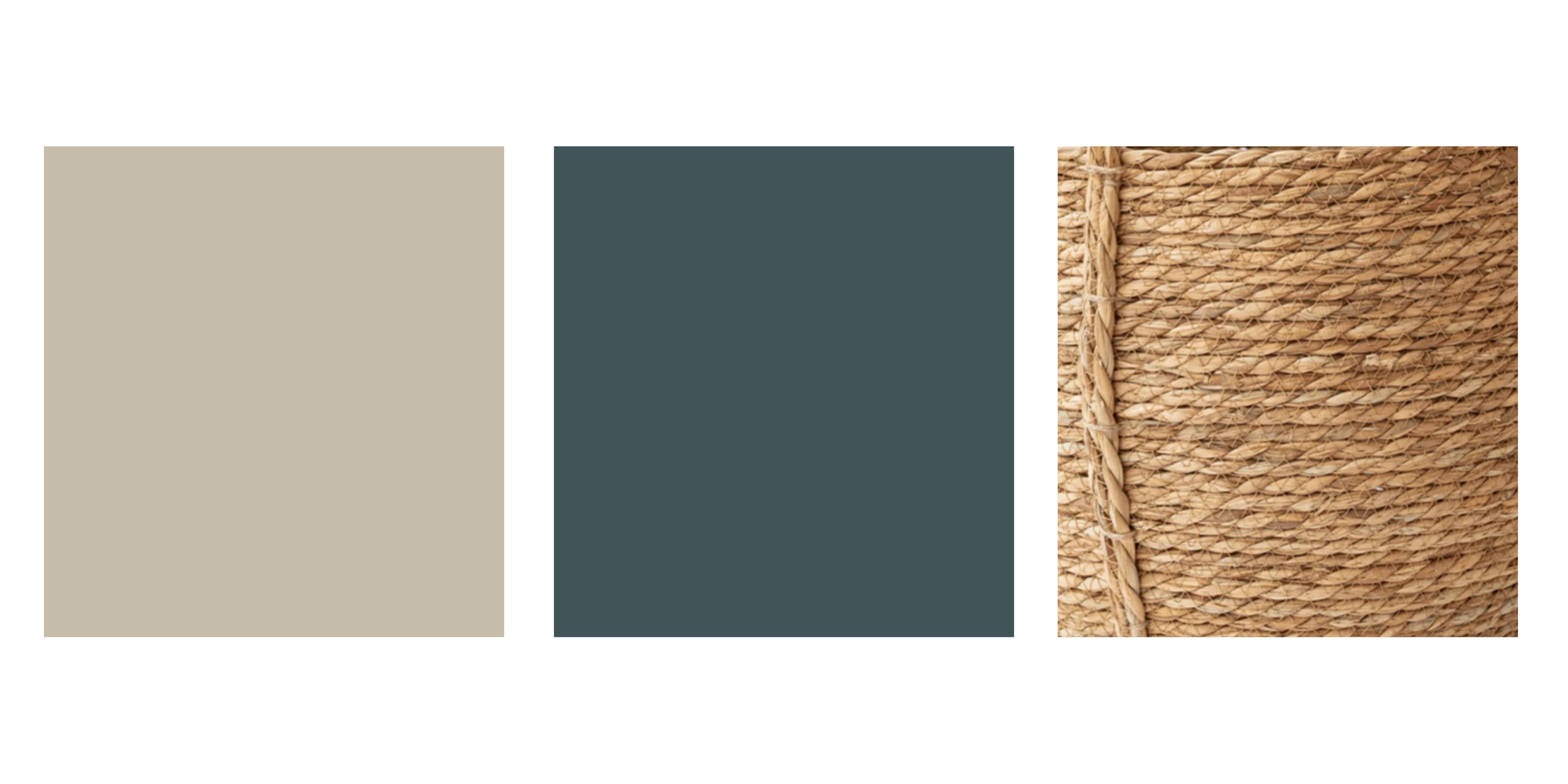
Existing Palette: Deep Blue/Navy
Recommended Khaki/Tan Pairing: Khaki (SW Universal Khaki)
How to Integrate with Decor: Use khaki throw pillows, natural woven baskets, and tan leather ottomans to soften the contrast.
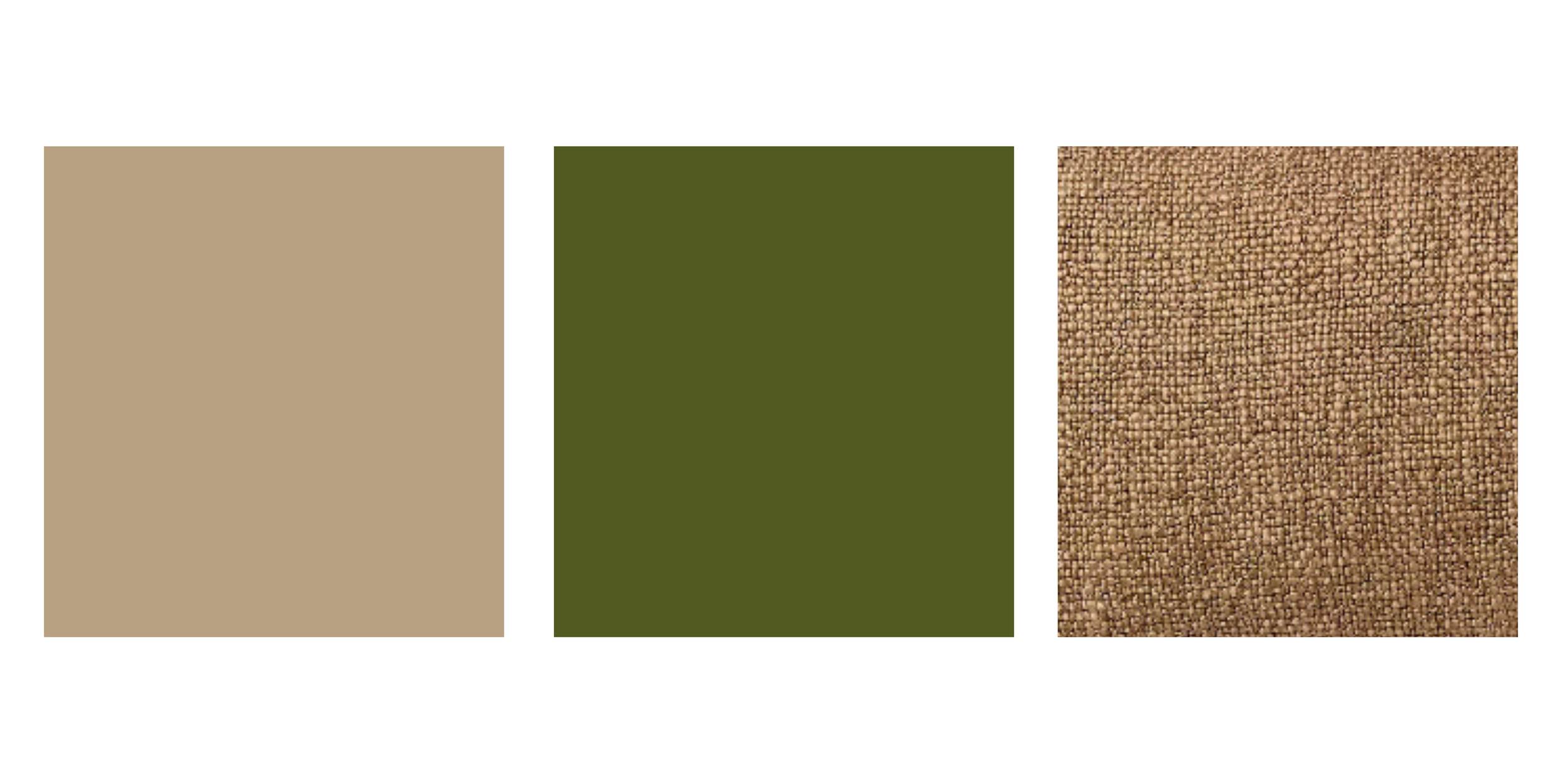
Existing Palette: Sage/Forest Green
Recommended Khaki/Tan Pairing: Tan (BM Sherwood Tan)
How to Integrate with Decor: A perfect earth-inspired match. Incorporate natural wood furniture and terracotta accents.
Existing Palette: Crisp White/Cream
Recommended Khaki/Tan Pairing: Both Khaki and Tan
How to Integrate with Decor: Layer varying shades of the neutrals in your decor. Think textured tan curtains with a khaki-colored ceramic vase.

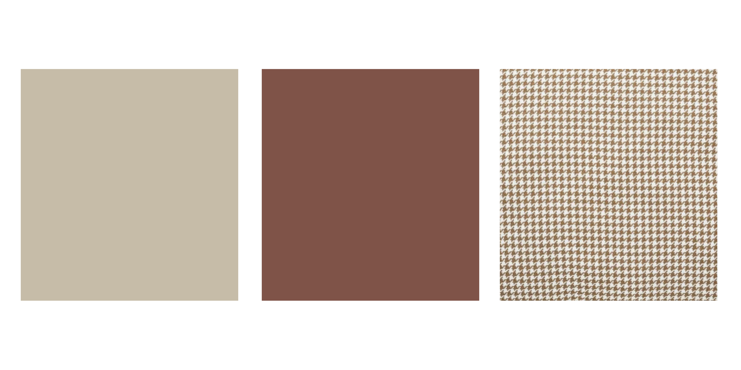
Existing Palette: Terracotta/Rust
Recommended Khaki/Tan Pairing: Khaki (SW Universal Khaki)
How to Integrate with Decor: The yellow-green undertone of khaki creates a beautiful, sun-baked contrast to warm reds.
The Khaki & Tan Takeaway
These mid-toned heritage neutrals are more than just a passing trend, they are a sign that design is moving towards comfort, longevity, and authenticity.
By using a paint color like Universal Khaki or Sherwood Tan as your backdrop, and integrating layered textures and sophisticated decor in the same neutral family, you create a home that is both effortlessly on-trend for 2026 and utterly timeless for years to come.