Earthy Whole House Paint Palette: Cozy Benjamin Moore Neutrals
This article contains affiliate links.
If you’re looking for a warm neutral whole house paint palette that feels cohesive, soft, and earthy, but stays clear of yellow undertones, I created this Benjamin Moore color scheme with exactly that in mind.
This palette has gentle, grounded neutrals throughout, a mix of muted greiges and beiges, plus one deeper accent shade to anchor everything.. Together they create a cohesive whole house color palette that works beautifully in both open floor plans and cozy rooms.
Homeowners have moved away from cool grays, bright whites, and yellow-beige. What’s taking their place are softer warm neutrals that feel easier to live with. They feel more natural, more relaxed, and they fit right in with the modern traditional look and the comfortable, transitional style people are gravitating toward.
What Makes This a Cohesive Whole House Neutral Paint Palette
A successful whole house paint color scheme should have a few things going for it. It should not only flow seamlessly from room to room, but also balance light, medium, and dark tones, share consistent undertones, and have some contrast.
With this palette, I incorporated a warm white base, mid-tone earthy neutrals, a slightly cooler neutral, and a deep contrast color for dimension. My goal was a muted color palette that leans heavily on green undertones to create the feeling of color, while keeping everything quietly neutral. All of these colors can be used wherever and however you want, creating a gorgeous and layered neutral home.
An Earthy, Warm and Muted Whole House Color Palette
Swiss Coffee – A Warm White for a Soft, Cohesive Base

One of the most popular warm white paint colors for interiors, Swiss Coffee manages to be soft and creamy, without heavy yellow undertones. It works in both north- and south-facing rooms, and is a great choice for open concept living spaces.
This is your foundation color for the palette, to be used on cabinetry, walls and trim throughout.
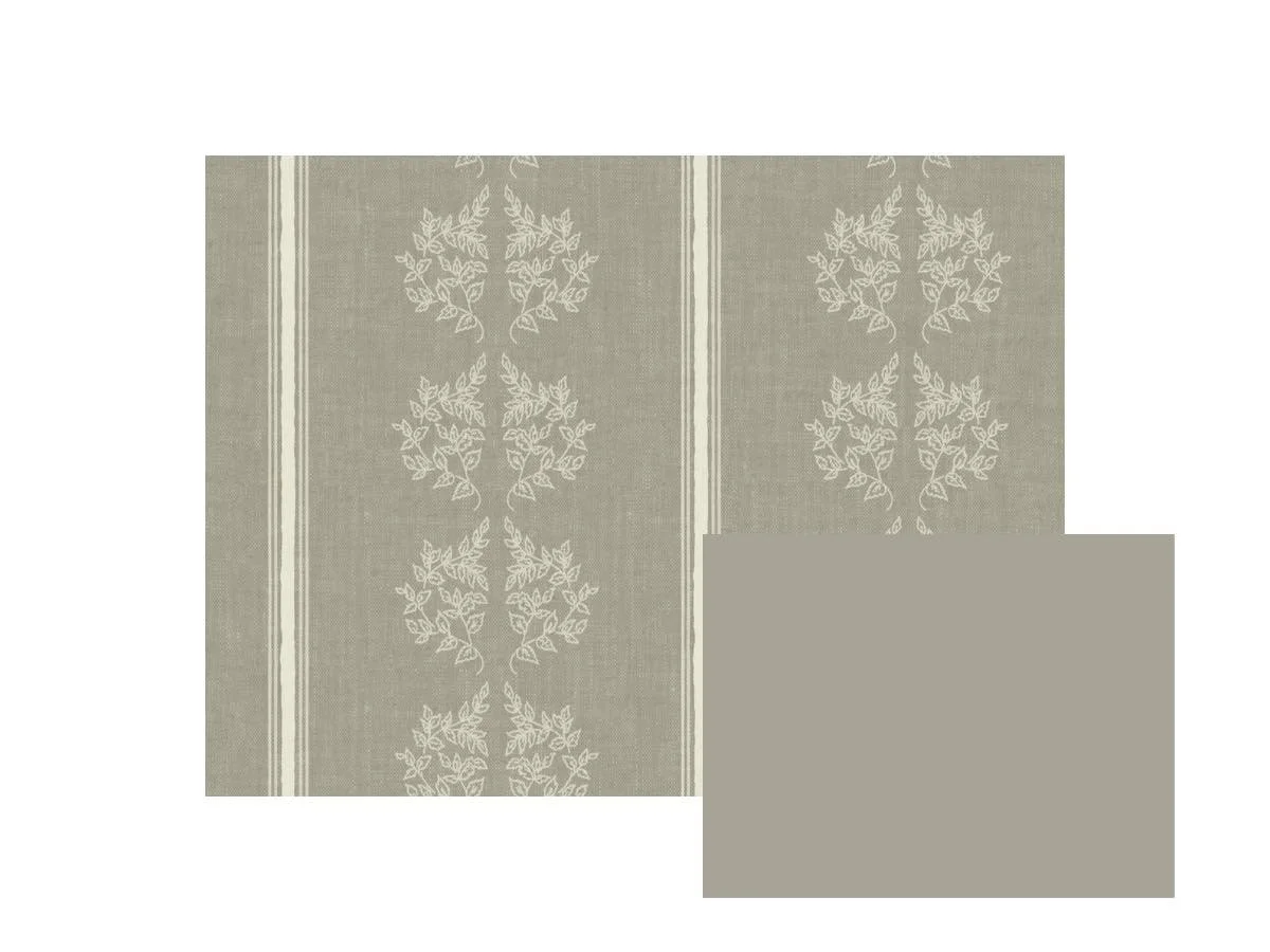
Storm Cloud Gray – A Soft Earthy Greige With Depth

A warm greige paint color with earthy undertones, Benjamin Moore describes Storm Cloud Gray as having a “hazy green tone”. The perfect embodiment of the term “colorful neutral”, it’s a slightly moody color that adds depth without overpowering.
Use it in a dining room, on a kitchen island, or bedroom. It’s perfect for adding contrast within a neutral palette.
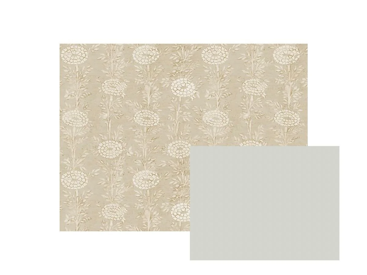
Gray Owl – A Light Cooler Neutral for Balance

Gray Owl is a light neutral paint color that feels soft and airy. It keeps the palette from feeling too heavy and is known for working magic in small, dark spaces
This gray acts as a balancing neutral in our palette.
Cedar Key – A Cozy Beige Without Yellow Undertones

A warm beige paint color that feels soft and earthy, Cedar Key is muted and cozy. Great for spaces where you want the overall vibe to feel relaxed and casual, such as a primary bedroom, or family room.
This is your cozy, grounding neutral.
Rockport Gray – A Mid-Tone Neutral for Contrast and Structure

A deeper warm neutral with strong earthy undertones, Rockport Gray adds visual weight and structure and works with modern and traditional spaces.
This creates a designer-level layered look when used on kitchen cabinets, built-ins, and bathroom vanities.
Midsummer Night – A Deep Earthy Accent Color

Midsummer night is your high-contrast anchor. It’s a dark brown paint color that feels rich and soft, and less harsh than black. This helps keep the overall color scheme soft and muted while also adding depth and sophistication
Try is on interior doors, furniture pieces, or the walls of any room you want to make super moody.
Layering Pattern and Texture for a Modern Traditional Look
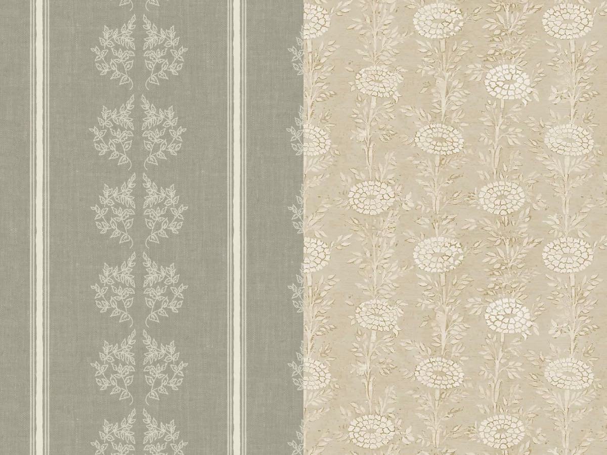
To enhance your palette, add wallpaper with subtle patterns or a bit of texture. It adds detail, more dimension and gives your eyes a place to land. For a modern traditional neutral home, those layers aren’t a nice bonus, they’re the difference between a pretty home and something really special.
How to Use This Whole House Paint Palette
Now that we’ve looked at the individual colors, let’s look at more ways they can work together across your home. These paint choices deliver a consistent, whole home color story, while still letting each room have its own mood.
Main Living Spaces
Walls and trim throughout: Swiss Coffee
Kitchen island: Midsummer Night
Built-ins or fireplace: Storm Cloud Gray
Doors: Midsummer Night or Rockport Gray
Secondary Rooms
Dining Room: Try the mid-tones here. Rockport Gray and Storm Cloud Gray would be great on their own with matching trim, with Swiss Coffee trim, or as a trim color used to accent wallpapered walls.
Home Office: I love a moody home office. Use Storm Cloud Gray of Midsummer Night.
Laundry/Half Bath: Cedar Key or Gray Owl
Bedrooms
Primary: Cedar Key or Midsummer Night
Secondary: Any of the colors in the palette would work for your secondary bedrooms. I love the idea of Gray Owl trim contrasting warm wallpapered walls for a cozy modern cottage vibe.
Bathrooms
Walls: Swiss Coffee
Vanity: Rockport Gray or Storm Cloud Gray
Hallways and Connecting Spaces
Stick with Swiss Coffee or Gray Owl for dark hallways
Notes About How Lighting Affects These Paint Colors
North-facing rooms:
Colors read cooler so use the warmer colors of the palette like Cedar Key and Swiss Coffee.
South-facing rooms:
Colors appear warmer which is a perfect opportunity to try out Storm Cloud Gray or Gray Owl.
Always test your paint colors in your home before committing to gallons of paint. Light changes everything! I highly recommend Samplize peel-and stick samples. You can move them from wall to wall, and room to room, making it incredibly easy to pick the right color from the start. Grab them HERE
Pin These Colors for Your Next Paint Project!
