3 Styling Mistakes That Make Your Home Feel Disjointed (And How to Fix Them in Minutes)
This article contains affiliate links.
You’ve chosen beautiful furniture, picked the perfect paint color, and added pieces you love, but somehow, the room still feels... off. More often than not, the issue isn’t the what, but the how.
Styling is the unsung hero of design. It’s the final layer that brings everything into balance, and the first thing that can quietly sabotage a room if it’s done wrong. The good news? Most styling mistakes are super simple to fix once you know what to look for.
Here are three common styling slip-ups that can make your home feel disjointed, plus the simple ways to fix them.
Related Post: Effortless Coffee Table Styling: 3 Formulas to Try Today
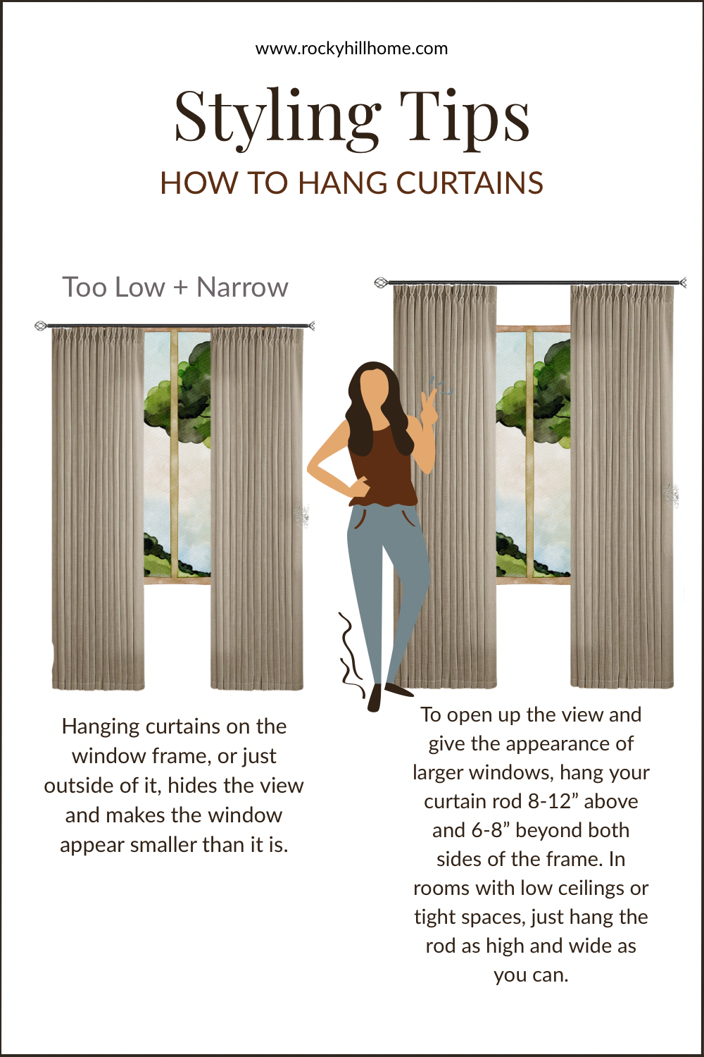
1. Hanging Curtains Right on the Window Frame
The Mistake:
Curtains mounted directly above the window or inside the trim might seem tidy, but they make the whole room feel shorter and more closed in. It’s one of the fastest ways to visually shrink your space.
The Fix:
Hang your curtain rod 8–12 inches above the window frame, and extend it at least 6-8 inches wider than the window on each side. This gives the illusion of taller ceilings and wider windows—and it lets in more light.
Styling Formula:
High + Wide = Elevated & Airy
✔ Rod: 8–12" above window
✔ Width: 6-8” beyond the window frame on each side
✔ Panels: Full-length, brushing or kissing the floor
Related Post: Where to Buy Stylish Curtains on a Budget (Plus an Affordable Curtain Roundup)
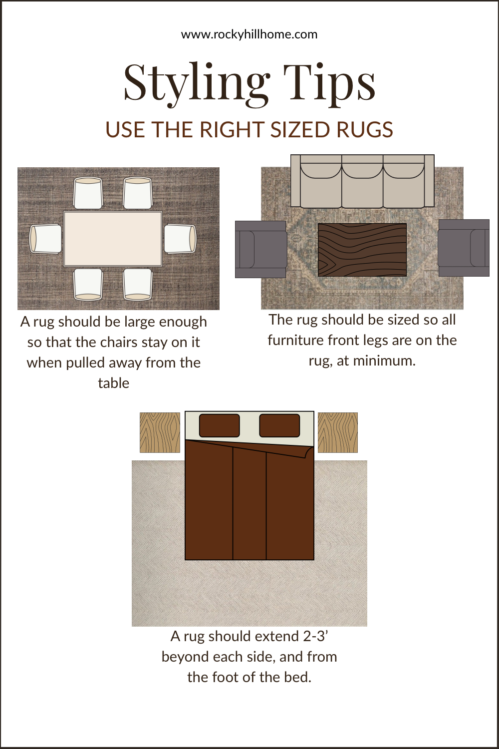
2. Rugs That Are Too Small for the Room
The Mistake:
A too-small rug can throw off the scale of the entire room. It often makes furniture feel like it's floating, makes the room appear smaller, and creates awkward visual gaps.
The Fix:
Choose a rug that anchors the full furniture arrangement. In a living room, at least the front legs of all major furniture pieces should sit on the rug. In a bedroom, the rug should extend beyond the sides and foot of the bed.
Styling Formula:
Bigger is (almost always) Better
✔ Living Room: Front legs on the rug
✔ Dining Room: Chairs should stay on the rug, even when pulled out
✔ Bedroom: Rug should extend ~2–3 feet past the sides of the bed
Pro Tip: If you already own a smaller rug you love, layer it over a large, neutral jute or sisal rug to get the right scale.
Related Post: The Best Rugs at Every Price Point: Budget-Friendly to Investment-Worthy Picks
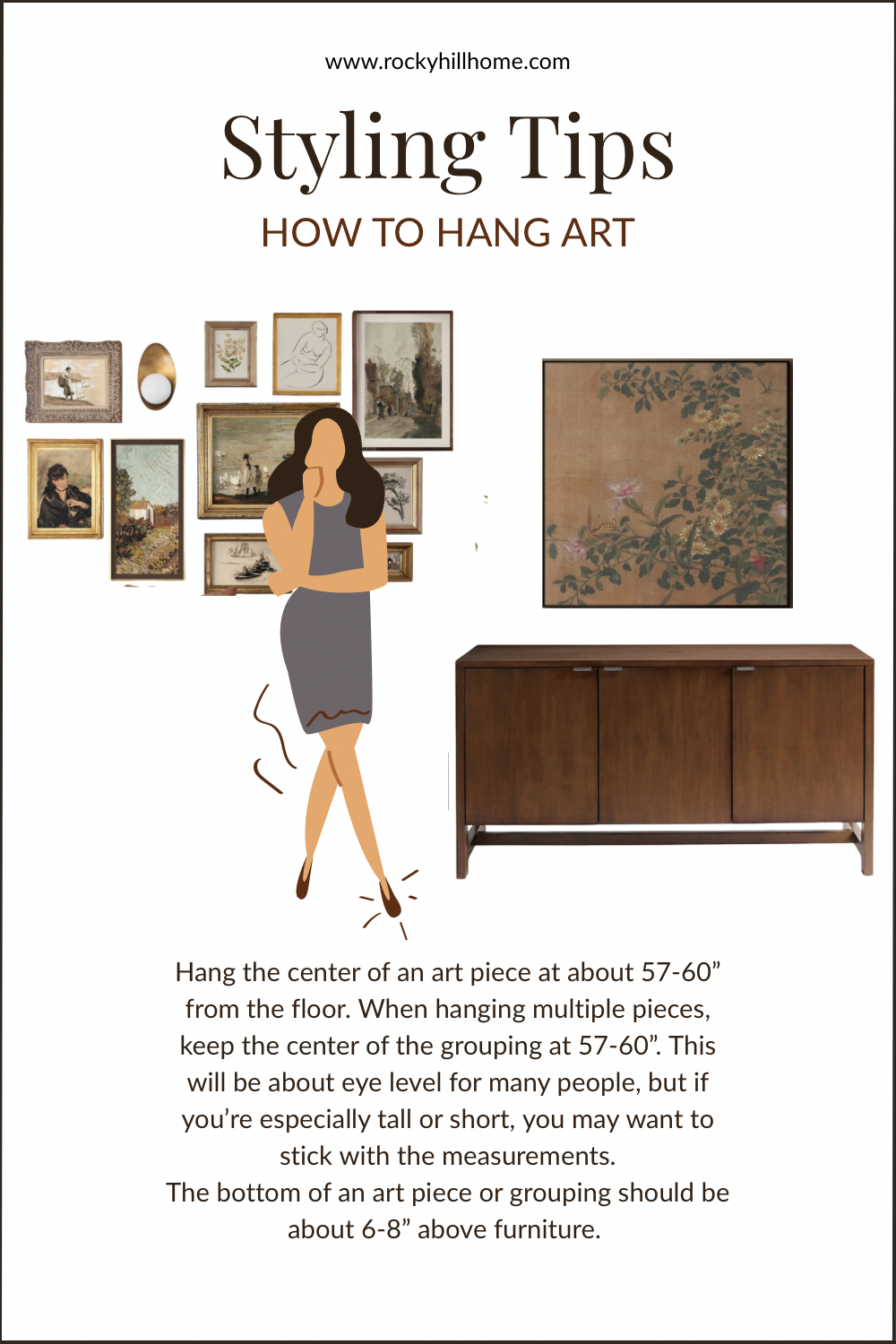
3. Artwork Hung Too High
The Mistake:
Art that floats too high on the wall loses its connection to the room and feels visually disconnected from the furnishings. It’s a small misstep that makes a big impact.
The Fix:
As a general rule, hang art so that the center of the piece is about 57–60 inches from the floor—roughly at eye level. When hanging above furniture, the bottom of the art should be 6–8 inches above the furniture below it.
Styling Formula:
Eye-Level + Anchored = Intentional
✔ Center = 57–60" off the floor
✔ Above furniture: 6–8" gap between frame and furniture
✔ Gallery walls: Treat the whole grouping as one piece, and follow the same rules
Products Featured in This Article:

Final Note:
These three mistakes are so common (and so easy to fix) that they’re the first things I look for when a space feels disjointed. The best part? With just a measuring tape and a few tweaks, your space can go from "not quite right" to "magazine-worthy" in minutes.
Want more simple design formulas and easy room upgrades? Be sure to sign up for my free mini paint guide and explore my Whole House Paint Palettes to create even more flow and cohesion throughout your home.
