The Best Neutral Paint Colors for Open Concept Living Areas
This article may contain affiliate links.
Even in homes that wouldn’t be considered “open concept”, there are areas open to each other. Kitchen-dining, dining-living, living-foyer, there are many combinations. In these open concept living areas, I always reach for neutral paint colors that help create warmth, cohesion, and a sense of ease. In a space without many walls to break things up, the right neutral does more than just blend in. It ties the entire floor plan together, makes the home feel larger, and sets the tone for all the decor layered on top.
If you’ve ever felt stuck choosing a paint color for an open layout, you know how hard it can be. I get questions about this all the time, What color makes the space feel cohesive? Will this neutral look yellow? Is this too gray? Today I’m sharing the best neutral paint colors for open concept living areas, especially if you love a warm, modern traditional look.
What Makes a Neutral Paint Color Work in an Open Concept Home?
When I choose a neutral for an open floor plan, I always look for colors that:
Have balanced undertones that work with many finishes and directional light.
Shift beautifully throughout the day
Provide just enough contrast against cabinetry and trim
Feel calm, cohesive, and timeless
For me, the sweet spot is to find your home’s warm neutrals, never too yellow, never too gray. These are the colors that make your home feel pulled-together even if you haven’t styled every corner yet. To find them, you’ll need to sample, sample, and sample some more. Start with the list below, and really take your time observing the samples on each wall, in each zone, throughout the day. Don’t rush it!
Related Post: How to Use a Whole House Color Palette for Seamless Flow
My Go-to Paint Colors for Creating a Warm, Connected Main Living Space.
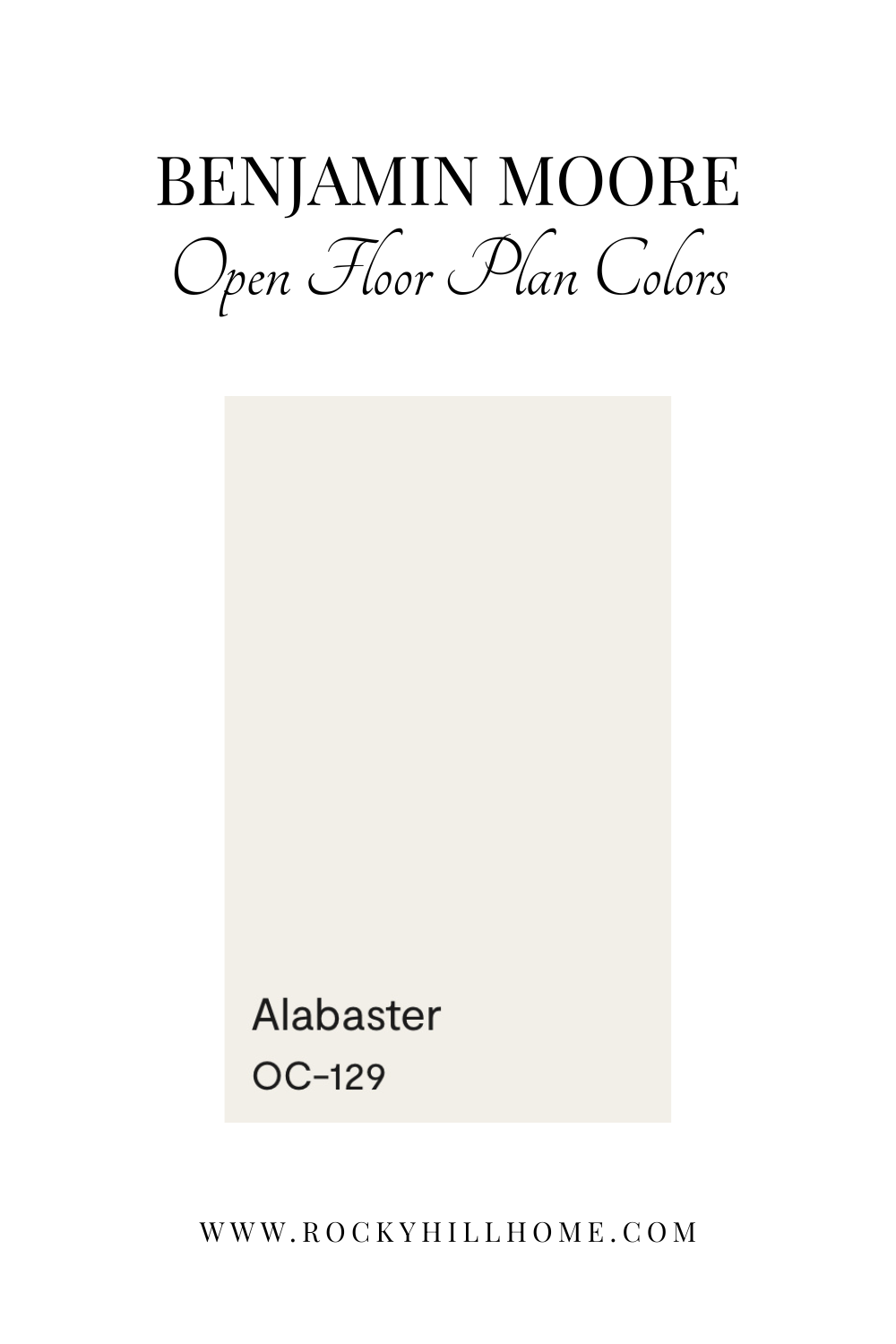
1. Benjamin Moore Alabaster
I was turned onto Alabaster when Nate Berkus named it as one of his favorite wall colors. After grabbing a sample of this gorgeous color, I was a convert. It’s a soft, creamy white that brings warmth and calm to an open concept home. I love using this color when I want the space to feel light, connected, and inviting without leaning stark or cold.
It has subtle pink undertone that keep it warm and balanced in shifting light, especially across a kitchen–living–dining flow. Alabaster looks beautiful with warm woods, brass fixtures, earthy tones, and cozy modern traditional styling.
Why it works:
Soft, warm white with a hint of pink
Pairs beautifully with natural textures and wood tones
Ideal whole-house wall color
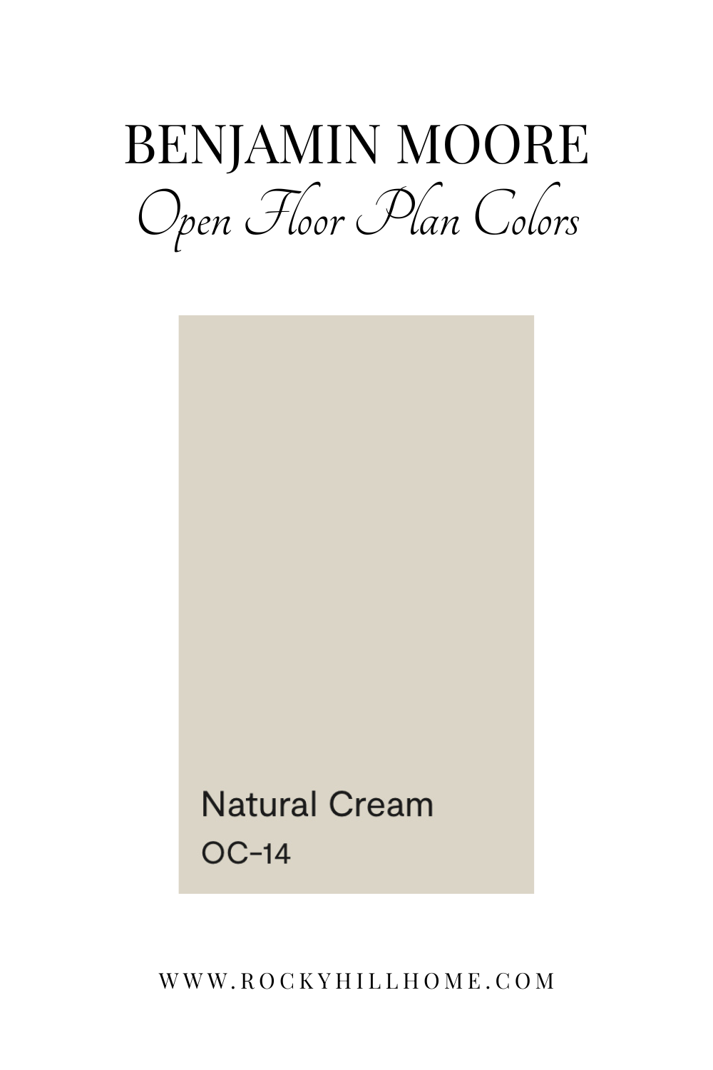
2. Benjamin Moore Natural Cream
Natural Cream is one of my all-time favorite neutrals for open concept homes. It's a cozy, soft, greige that really sings.
Why it works:
Perfect with oak floors and natural textures
Creates a cohesive main level
Looks great in warm and cool color schemes
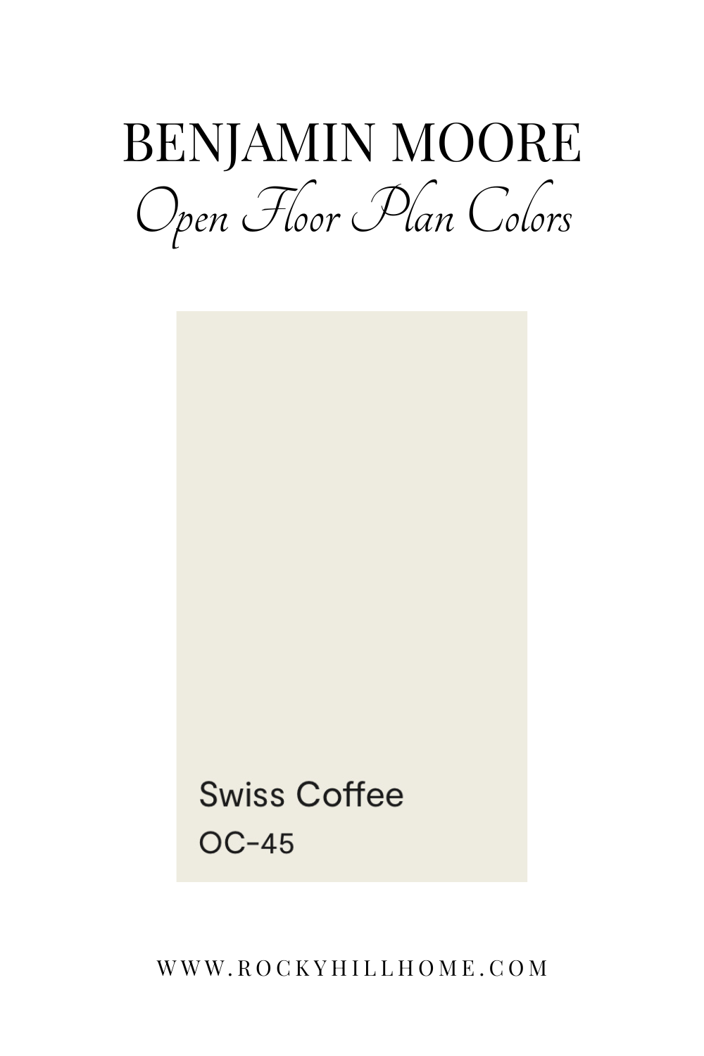
3. Benjamin Moore Swiss Coffee
If Swiss Coffee isn’t Benjamin Moore’s most popular color, it’s certainly close. A favorite of Shea McGee, Swiss Coffee is warm, inviting, and timeless. It makes a whole main level feel soft and connected.
Why it works:
Beautiful with brass, wood, and warm whites
Welcoming and bright
Great whole-house neutral
Related Post: How to Choose the Perfect White Paint Color for Your Walls
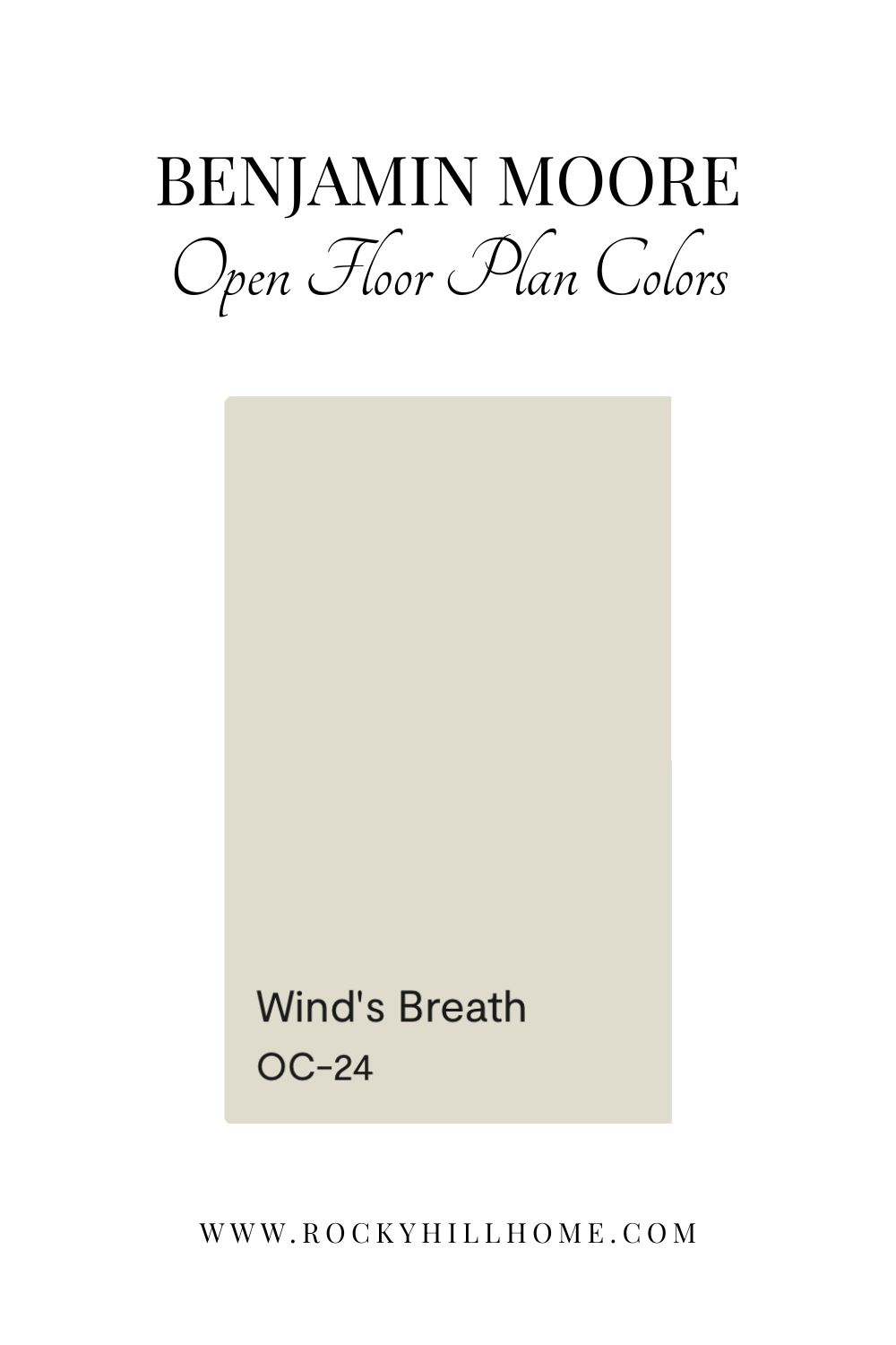
4. Benjamin Moore Wind’s Breath
Wind’s Breath brings warm, earthy softness to a space. It has an organic feel that pairs well with natural textures.
Why it works:
Warm but airy
Looks beautiful with warm woods
Great for open layouts with mixed lighting
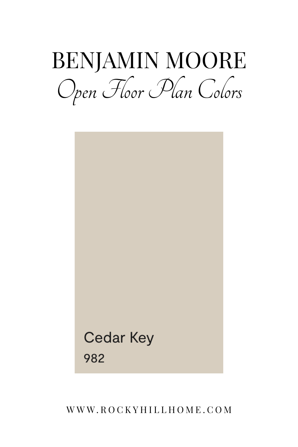
5. Benjamin Moore Cedar Key
Cedar Key is a warm, earthy neutral with subtle red undertones that make it incredibly cozy in open spaces. It’s richer than the lighter neutrals above, yet still soft and very livable.
Why it works:
Adds depth without heaviness
Gorgeous with warm wood, leather, and brass
Ideal for creating a cozy, grounded main level
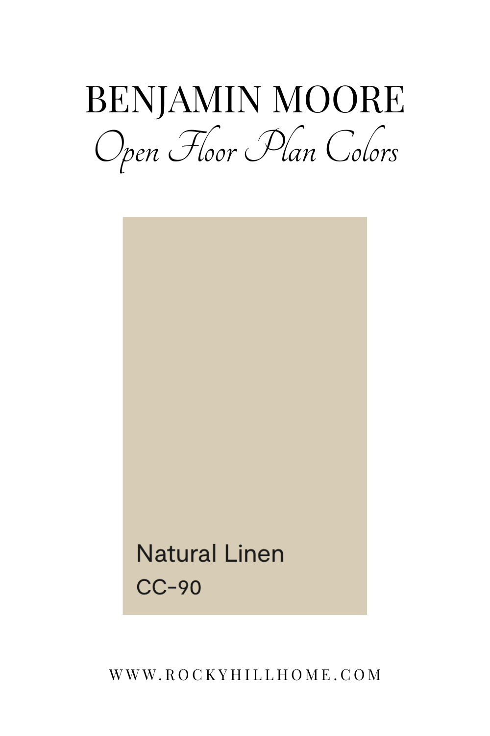
6. Benjamin Moore Natural Linen
Natural Linen is one of those warm neutrals that feels instantly layered and inviting. It leans into a soft beige undertone with a warm, comfortable warmth that makes open floor plans feel cohesive and relaxed.
If you’re looking for a bit more mood in your neutrals, try Natural Linen walls paired with a dark accent color, like Bucktrout Brown or Black, on built-ins, kitchen island, and fireplace.
Why it works:
Warm and inviting without feeling yellow
Beautiful with oak floors and organic textures
Adds soft contrast to white kitchens
Perfect for open layouts where you want a natural, collected look
Related Post: Best Warm Neutral Paint Colors for a Cozy Home
How to Choose the Best Neutral Paint for Your Open Floor Plan
When I'm narrowing down the final color for an open concept home, I always do these three things:
1. Sample in multiple rooms.
Because open layouts have different light sources, I always test samples in the kitchen, dining, and living areas. You’ll want to see the color in every zone, under every lighting condition. I highly recommend Samplize for your samples. The process is so much easier when you can move the sample from wall to wall without actually painting.
2. Test next to fixed elements.
Paint must work with your floors, counters, cabinetry finishes.
3. Choose one “hero” neutral color.
In open floor plans, one main color across the entire level keeps the space cohesive and visually calming. After testing and watching your samples, you’ll be ready to head to the paint store!
Final Note
Choosing a neutral paint color for an open concept living area doesn’t have to feel overwhelming. When you stick with warm, timeless neutrals that look beautiful in shifting light, the entire space instantly feels bigger, cozier, and more unified. These are the colors I turn to again and again and they always deliver that effortless, modern traditional look I love. Just take your time, and try to enjoy the process.
If you want help choosing a paint color for your open layout, I share lots of curated palettes and guides here on the blog.
