The Best Paint Colors for Low Light Rooms (That Don’t Feel Like a Cave)
This article contains affiliate links
If you’ve ever tried to pick a paint color for a dark room, you know how tricky it can be. Colors that look soft and welcoming on the swatch can turn muddy, dingy, or just plain depressing once they hit the wall in a space with limited natural light.
Whether you're working with a small room, no windows, or just not a lot of sunshine, these colors are my tried-and-true favorites for bringing low-light rooms to life.

What Makes a Color Work in a Low-Light Room?
When I’m choosing paint for a darker space, I look for:
Warm or cool undertones to balance what little light is in the space. Low-light rooms can be made especially dark when facing north, but even with a southern exposure, one little window is not enough to keep the space from feeling dreary.
Mid-tone depth (too light can feel flat, too dark can feel heavy) These are colors that sit right in the middle of the LRV (Light Reflectance Value) scale, between 40-60 LRV.
Soft, muted hues that still bring character
A matte or eggshell finish to reduce harsh glare from artificial lighting
The hard truth is that no paint color is going to magically make a dark room look bright, but the right paint color can make it feel interesting and alive. That’s the aim here, to feel good in the space.
With all that said, here are some of my favorite Benjamin Moore paint colors that perform beautifully in low-light rooms:
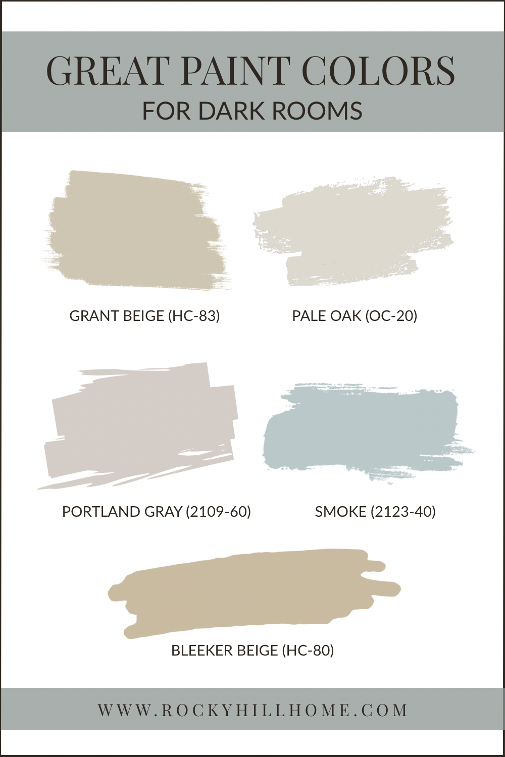
1. Grant Beige (HC-83)
Undertone: Warm greige, LRV: 55.81
Grant Beige is a classic warm neutral that never goes too yellow or too gray. In low-light rooms, it takes on a soft, cozy glow that instantly warms up the space.
I used this in my own home to warm up a dark cave of a room. My son’s north facing bedroom (which has just one window!) became a cozy and comfortable space thanks to Grant Beige. I really love it!
Pairs Well With: Creamy whites, muted greens, and walnut wood tones.
2. Bleeker Beige (HC-80)
Undertone: Taupe with green-gray, LRV: 51.66
Bleeker Beige is deeper and more grounded than Grant Beige, with a subtle green-gray undertone that keeps it from feeling too warm. It brings elegance and warmth to dark dining rooms, dens, or offices.
Pairs Well With: Creamy trim, black accents, and warm woods.
3. Pale Oak (OC-20)
Undertone: Soft greige with warm undertones LRV: 68.44
A bit lighter than the other options, Pale Oak is a beautiful neutral that holds its warmth in low light, making it ideal for small spaces or transition areas. It won’t go stark or cold, even in artificial light.
Pairs Well With: Soft blues, linen textures, and natural wood.
4. Portland Gray (2109-60)
Undertone: Violet-gray, LRV: 60.21
Portland Gray is quietly beautiful. The subtle lavender undertone adds life and personality to darker rooms without overwhelming them.
Another personal favorite, I chose Portland Gray for my daughter’s room. It’s the perfect balance of neutral and color, looking gorgeous in the northeast light of her bedroom at all times of day.
Pairs Well With: Deep navy, brass, and moody florals. Or creamy white, soft muted colors and pastels.
5. Smoke (2122-40)
Undertone: Blue-gray, LRV: 56.39
Smoke brings a calm, collected mood to any low-light space. It’s a great option for those dark rooms with southern or western exposures where it can balance the warmth of what little light there is.
Pairs Well With: White Dove trim, oak floors, and brass or black hardware.
Final Note
Low-light rooms don’t have to feel gloomy or cold. With the right paint color, they can become some of the most inviting spaces in your home. Whether you lean toward classic neutrals like Grant Beige or want something with a little twist like Portland Gray, the key is choosing colors with enough warmth and body to hold their own without sunlight.
I always recommend Samplize for sampling the paint in your actual space. Lighting changes everything—and seeing the color on your wall (at different times of day!) is the best way to know for sure.
Want a curated palette that takes the guesswork out of choosing paint?
Grab one of my Whole House Paint Guides—ready-to-use Benjamin Moore palettes designed for timeless, cozy homes. Or have the FREE Mini Paint Guide sent straight to your mailbox!